| country | continent | year | lifeExp | pop | gdpPercap |
|---|---|---|---|---|---|
| Afghanistan | Asia | 1952 | 29 | 8425333 | 779 |
| Afghanistan | Asia | 1957 | 30 | 9240934 | 821 |
| Afghanistan | Asia | 1962 | 32 | 10267083 | 853 |
| Afghanistan | Asia | 1967 | 34 | 11537966 | 836 |
| Afghanistan | Asia | 1972 | 36 | 13079460 | 740 |
POL 051 - Summer Session 1 2026
Data carries weight in our society
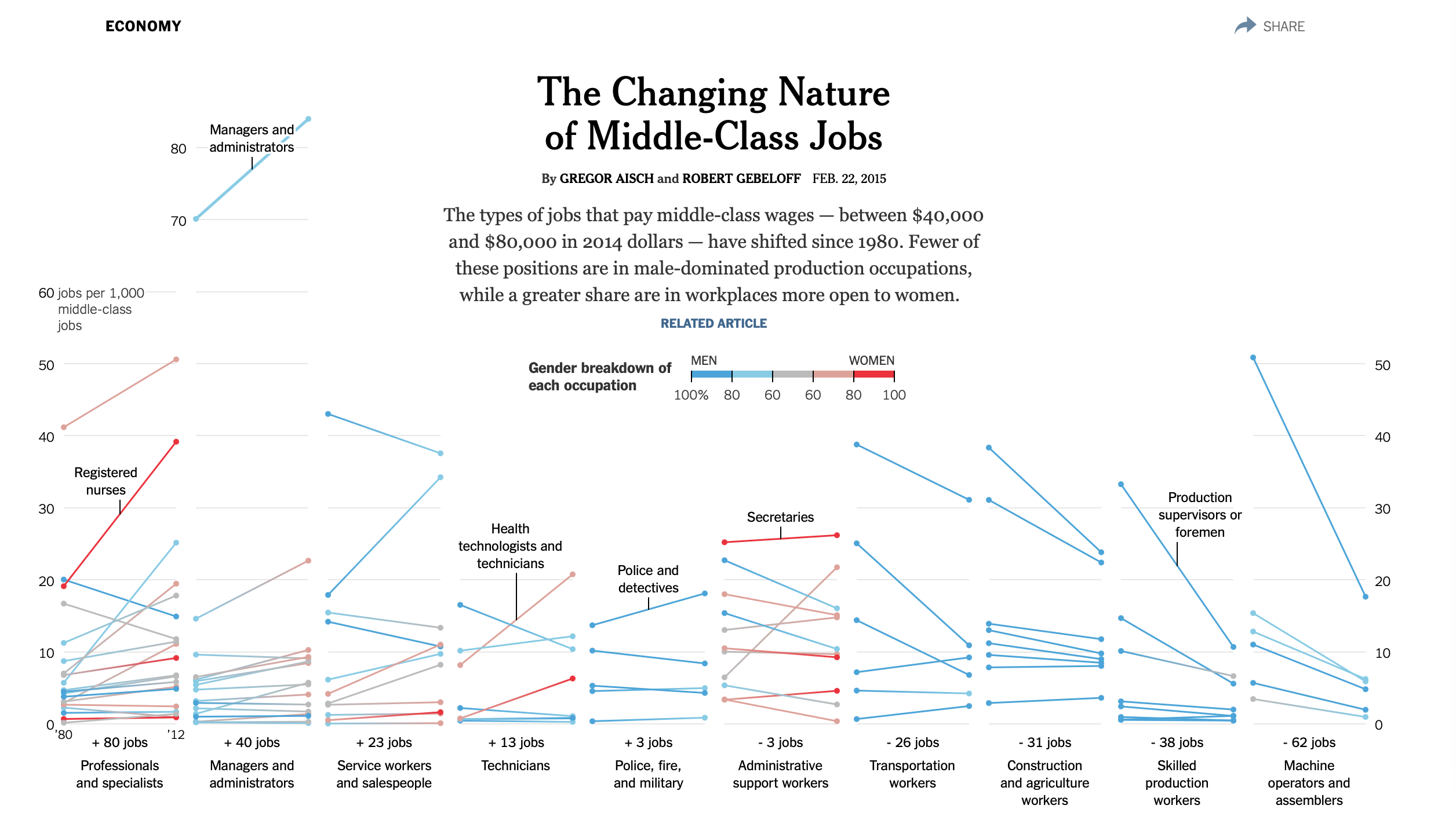
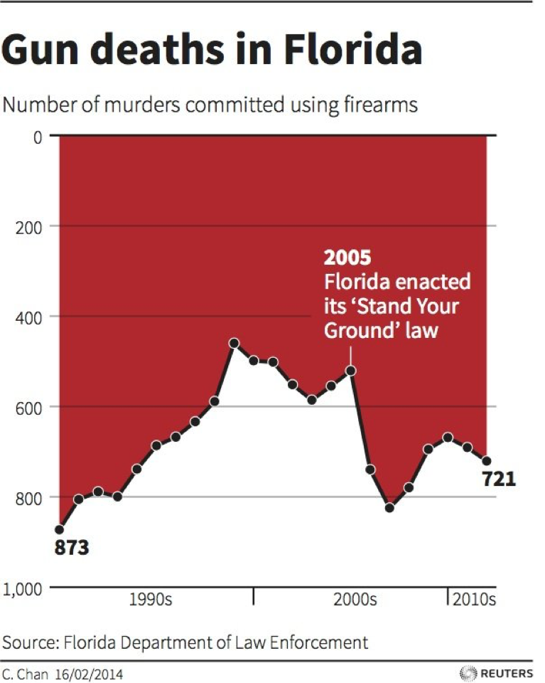
Visualizing data is an effective way to convey information, convince, argue
Visualization can be used to tell The Truth™️ (or not)
R| country | continent | year | lifeExp | pop | gdpPercap |
|---|---|---|---|---|---|
| Afghanistan | Asia | 1952 | 29 | 8425333 | 779 |
| Afghanistan | Asia | 1957 | 30 | 9240934 | 821 |
| Afghanistan | Asia | 1962 | 32 | 10267083 | 853 |
| Afghanistan | Asia | 1967 | 34 | 11537966 | 836 |
| Afghanistan | Asia | 1972 | 36 | 13079460 | 740 |
| country | continent | year | lifeExp | pop | gdpPercap |
|---|---|---|---|---|---|
| Afghanistan | Asia | 1952 | 29 | 8425333 | 779 |
| Afghanistan | Asia | 1957 | 30 | 9240934 | 821 |
| Afghanistan | Asia | 1962 | 32 | 10267083 | 853 |
| Afghanistan | Asia | 1967 | 34 | 11537966 | 836 |
| Afghanistan | Asia | 1972 | 36 | 13079460 | 740 |
In a dataset, rows are observations
The data we observe for Afghanistan in the year 1952
| id | age | degree | race | sex |
|---|---|---|---|---|
| 1 | 47 | Bachelor | White | Male |
| 2 | 61 | High School | White | Male |
| 3 | 72 | Bachelor | White | Male |
| 4 | 43 | High School | White | Female |
| 5 | 55 | Graduate | White | Female |
In survey data, an observation is typically a person who took the survey (a respondent)
| country | continent | year | lifeExp | pop | gdpPercap |
|---|---|---|---|---|---|
| Afghanistan | Asia | 1952 | 29 | 8425333 | 779 |
| Afghanistan | Asia | 1957 | 30 | 9240934 | 821 |
| Afghanistan | Asia | 1962 | 32 | 10267083 | 853 |
| Afghanistan | Asia | 1967 | 34 | 11537966 | 836 |
| Afghanistan | Asia | 1972 | 36 | 13079460 | 740 |
In a dataset, columns are variables
Life expectancy and GDP per capita are some of the variables in our data
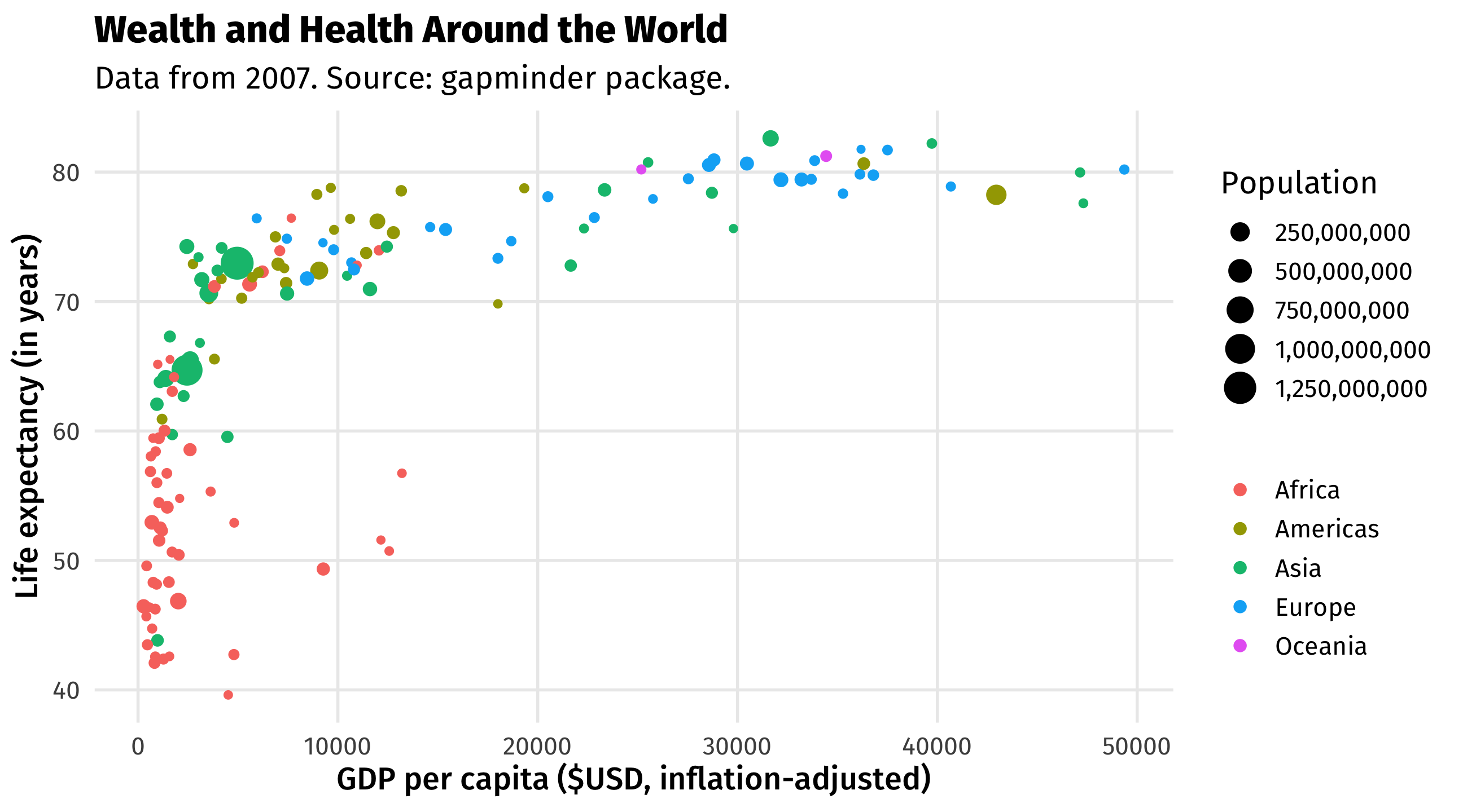
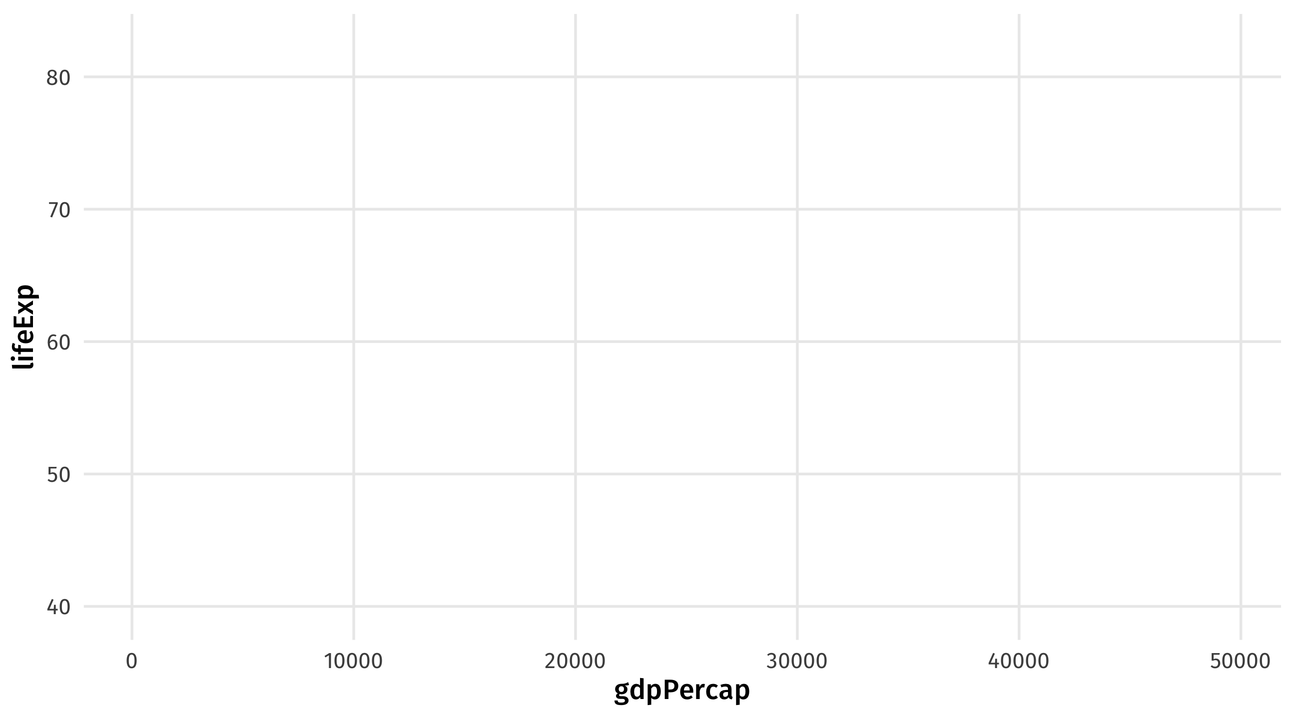
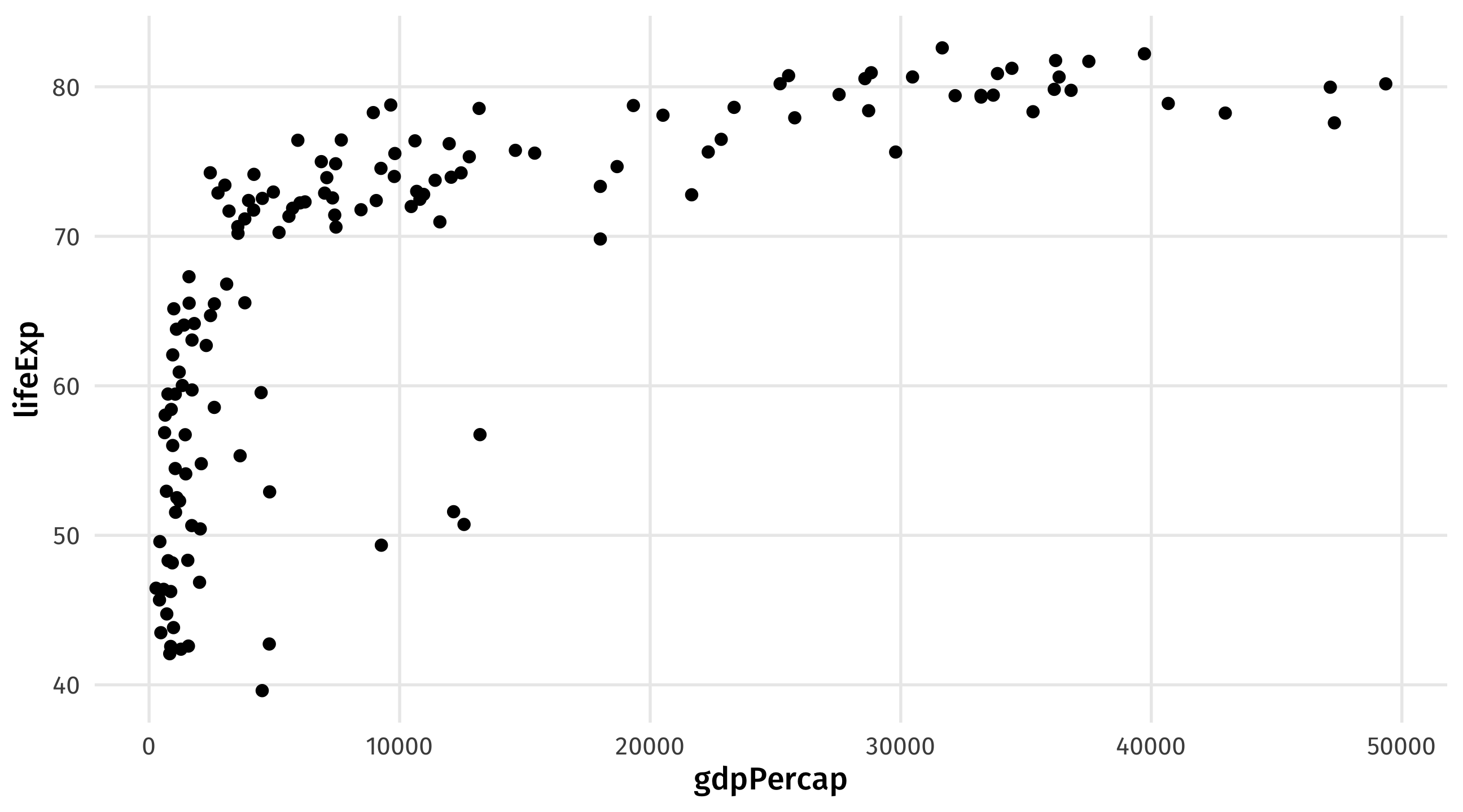
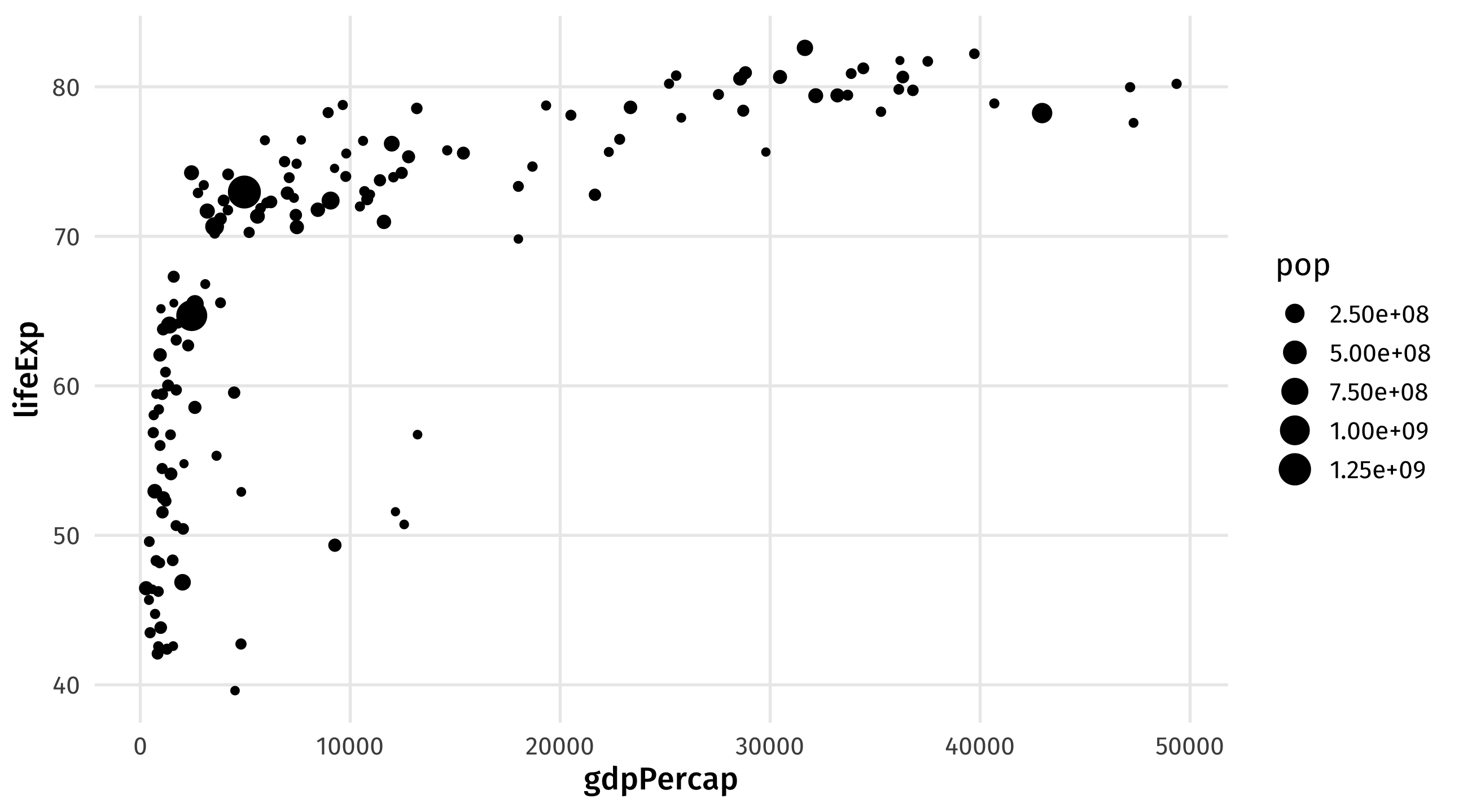
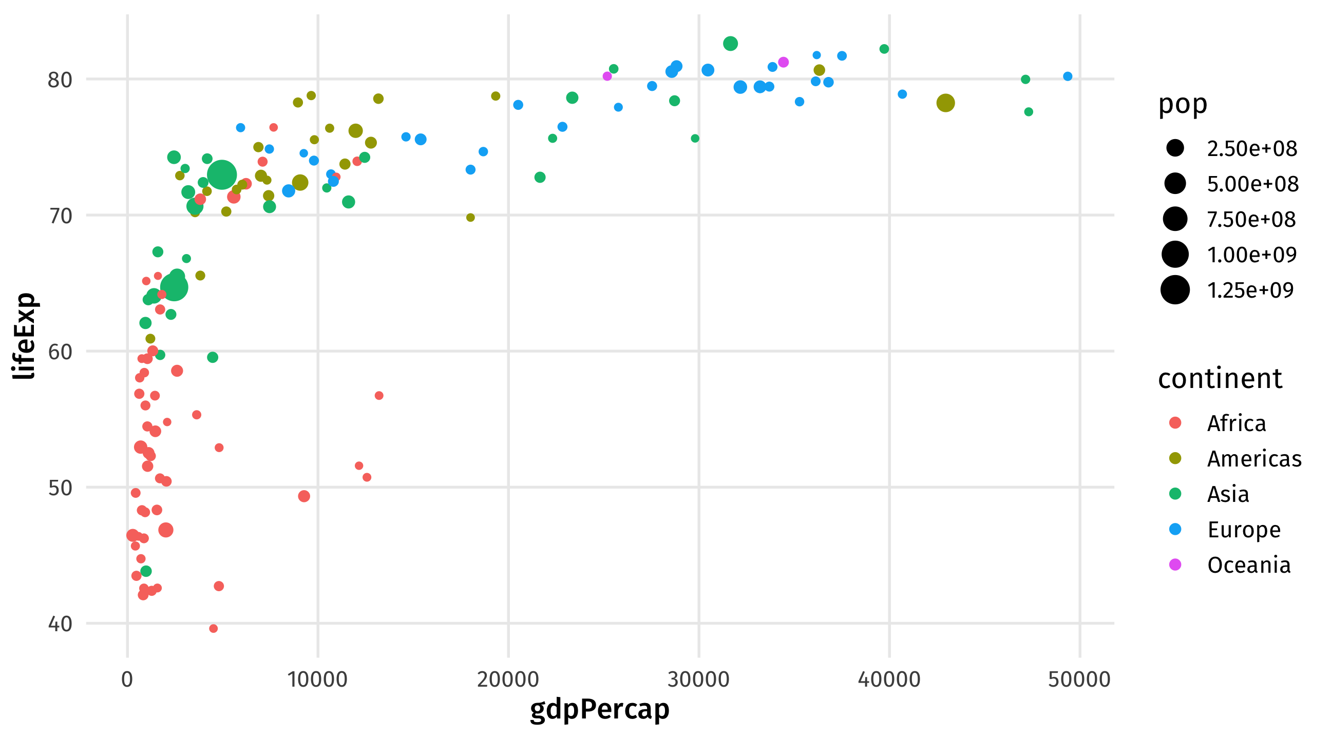
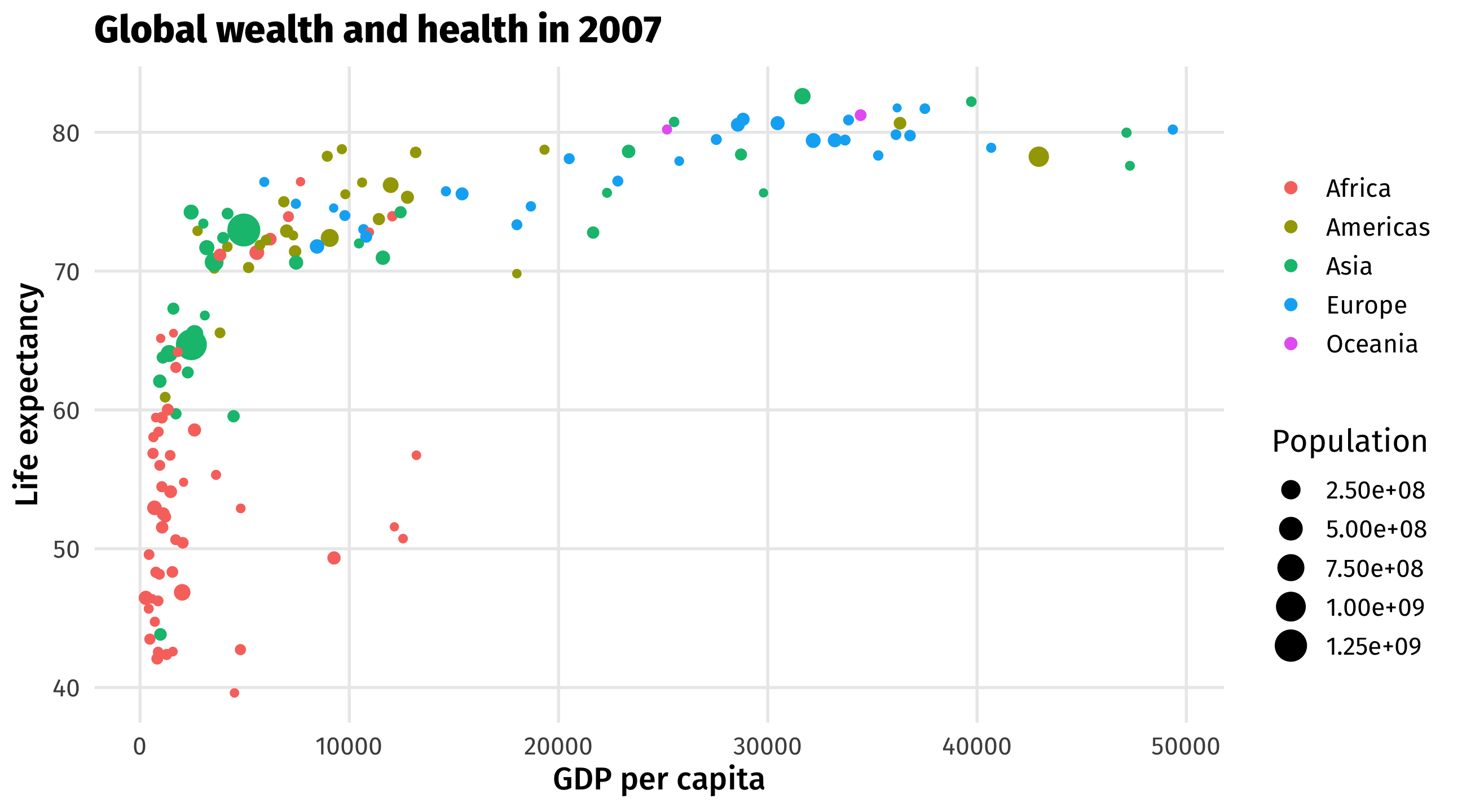
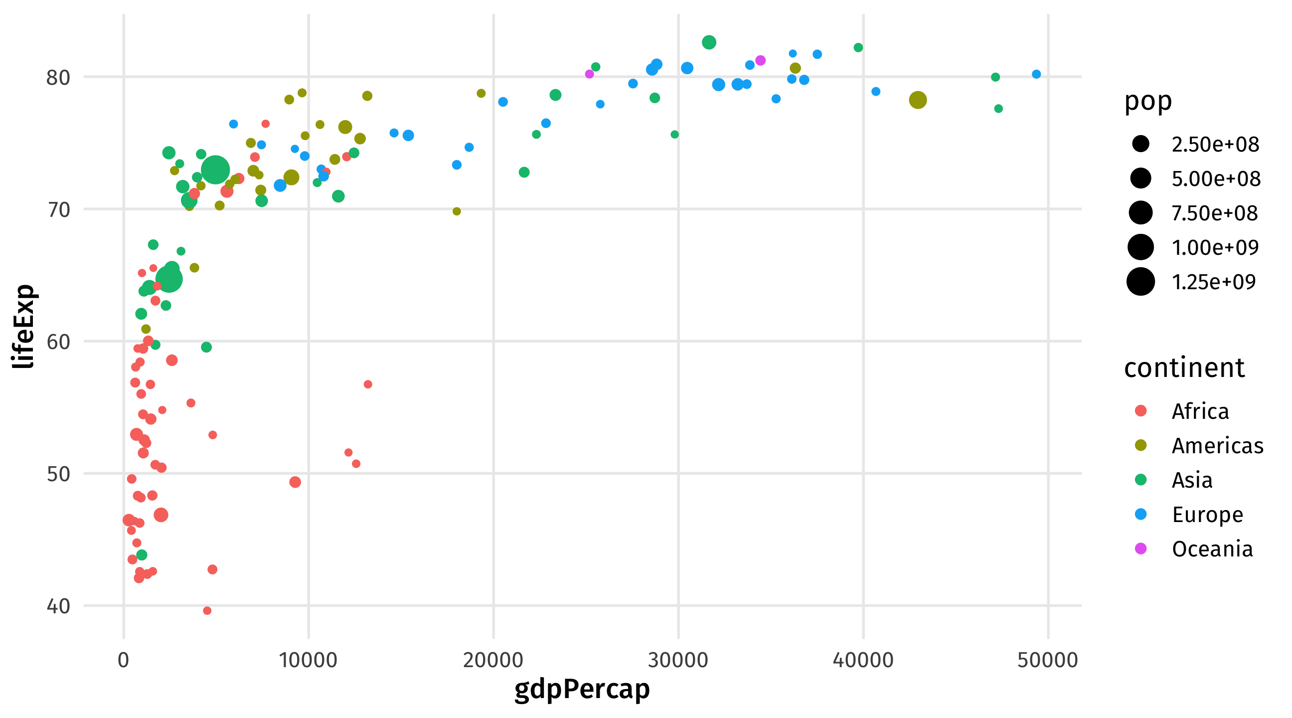
There are four variables on this graph. What are they?
Graphs have an internal logic, or grammar that connects data to visuals
Data = variables in a dataset
Aesthetic = visual property of a graph (position, shape, color, etc.)
Geometry = representation of an aesthetic (point, line, text, etc.)
| Data | Aesthetic | Geometry |
|---|---|---|
| GDP per capita | Position(x-axis) | Point |
| Life expectancy | Position (y-axis) | Point |
| Continent | Color | Point |
| Population | Size | Point |
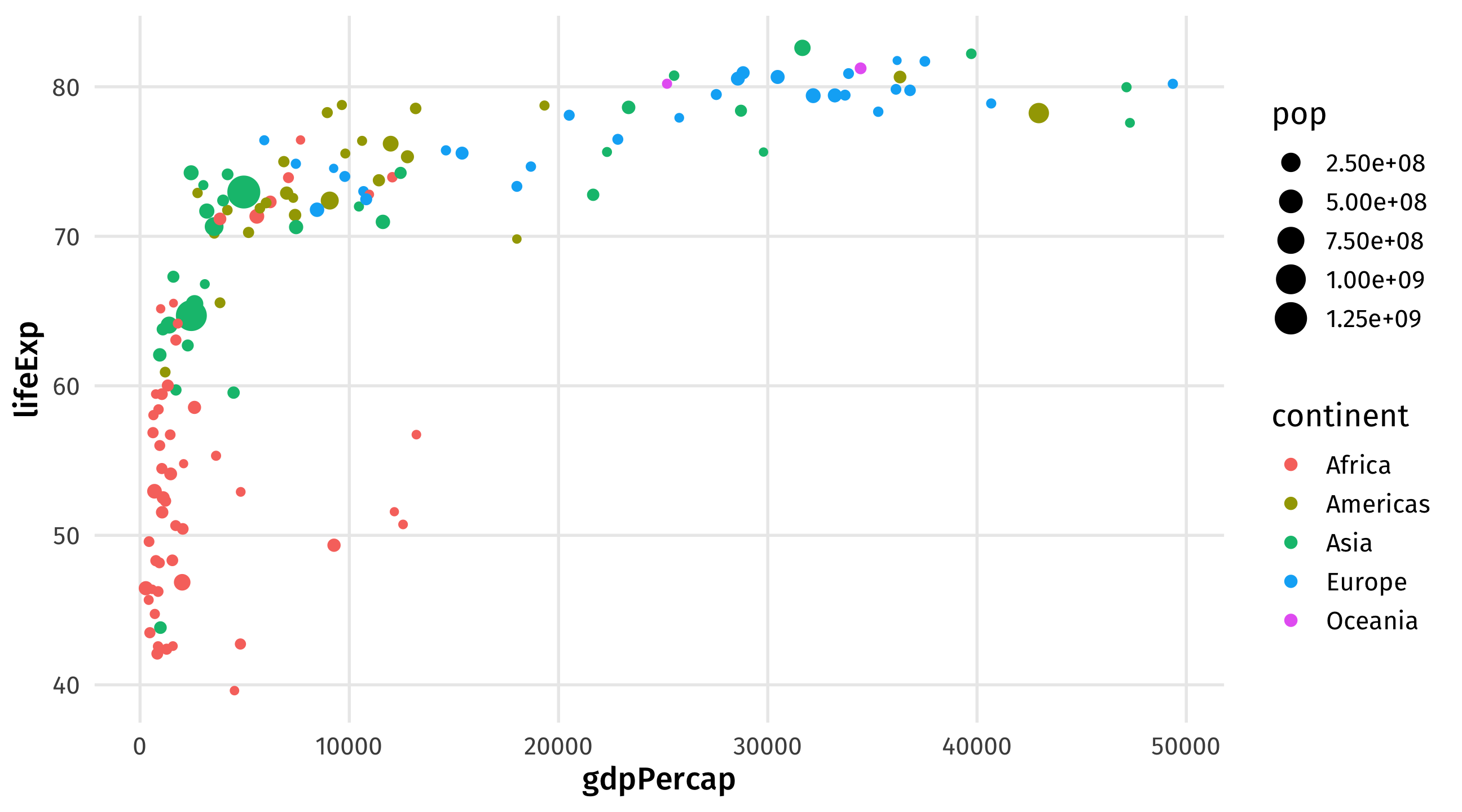
Take the data,
map it onto an aesthetic,
and visualize it with a geometry
| Data | aes() | geom_ |
|---|---|---|
| gdpPercap | x | geom_point() |
| lifeExp | y | geom_point() |
| continent | color | geom_point() |
| pop | size | geom_point() |
Use the variable names exactly as they appear in the data, map them onto the exact function names in R
ggplot(): our first function 😢don’t fret; You will not memorize these as they appear on screen
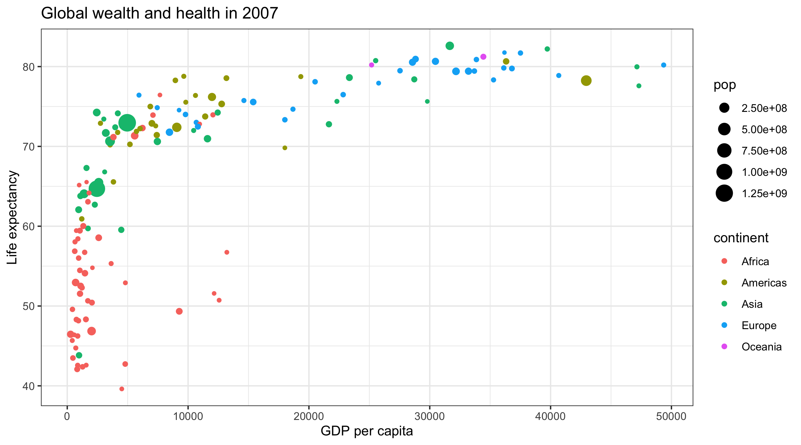
ggplot: specify the dataaes() to map variables to aesthetics+aes()aes()labs()Notice that text is placed within quotation marks!
There are many more themes, here are a few
Tell ggplot() the data we want to plot
Map all variables onto aesthetics within aes()
Add layers like geom_point() and theme_bw() using +
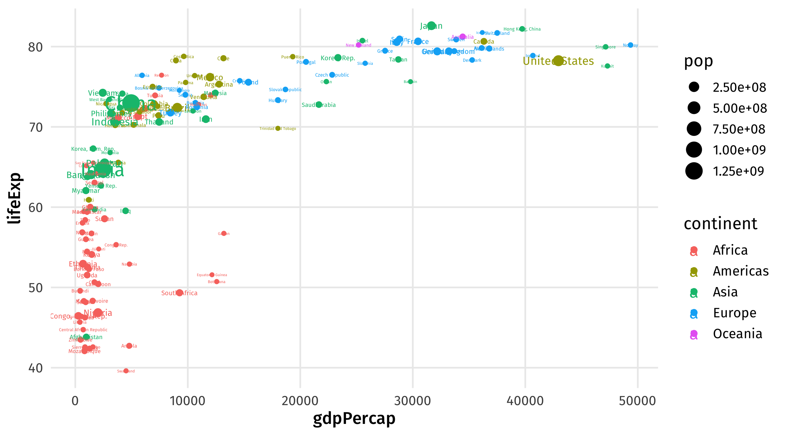
Add labels to each point by mapping country names onto the label aesthetic within aes()
Add geom_text layer to your plot to plot the names
| Data | Aesthetic | Geometry |
|---|---|---|
| gdpPercap | x | geom_point() |
| lifeExp | y | geom_point() |
| continent | color | geom_point() |
| pop | size | geom_point() |
| country | label | geom_text() |
Take your data, map it onto an aesthetic, represent with a geometry
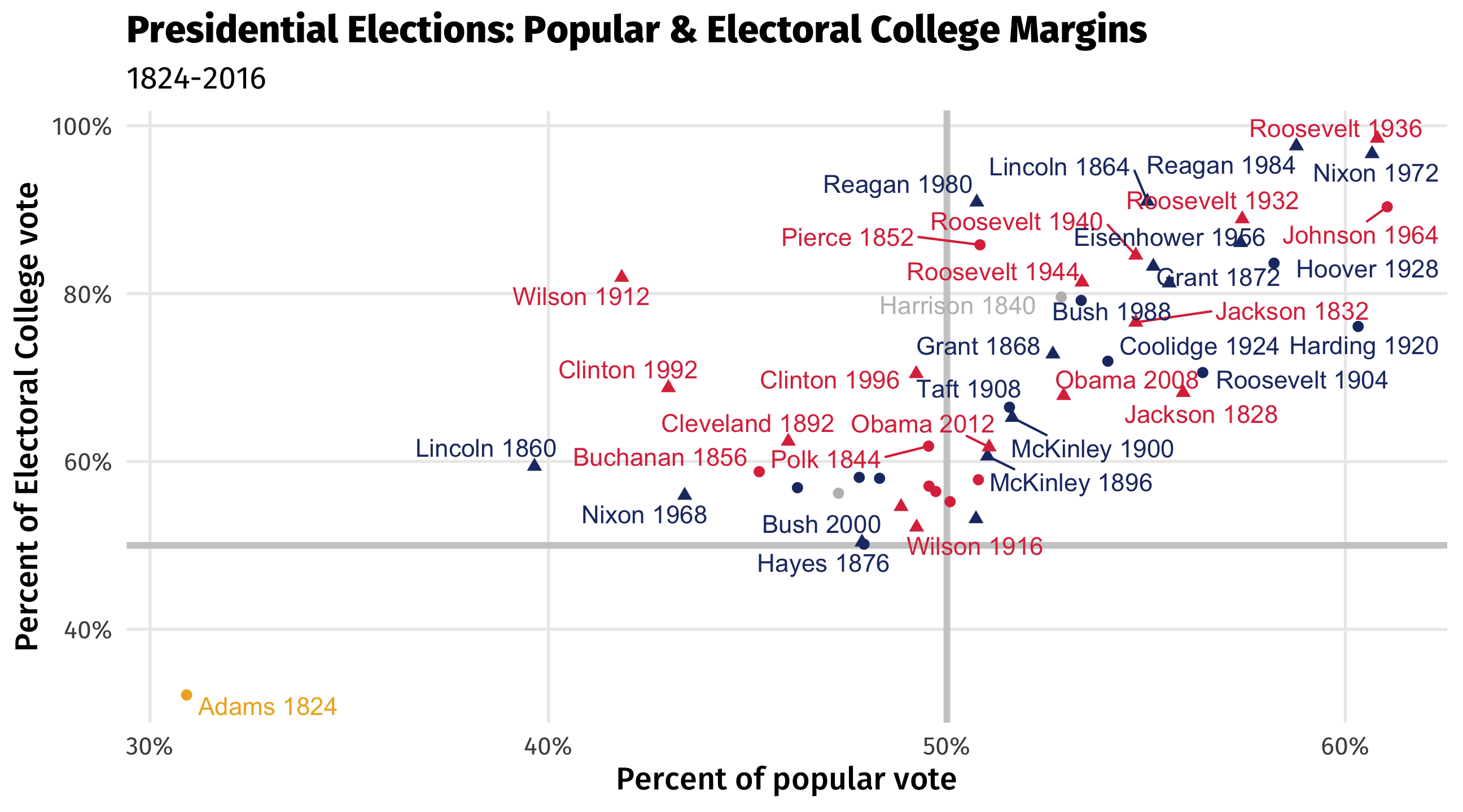
Make a plot of presidential election results using the elections_historic dataset
% of popular vote (x-axis, popular_pct) and % of electoral college vote (y-axis, ec_pct)
map the winner’s party to the color aesthetic, whether or not president served two terms to shape, and add labels to each point (use winner_label)
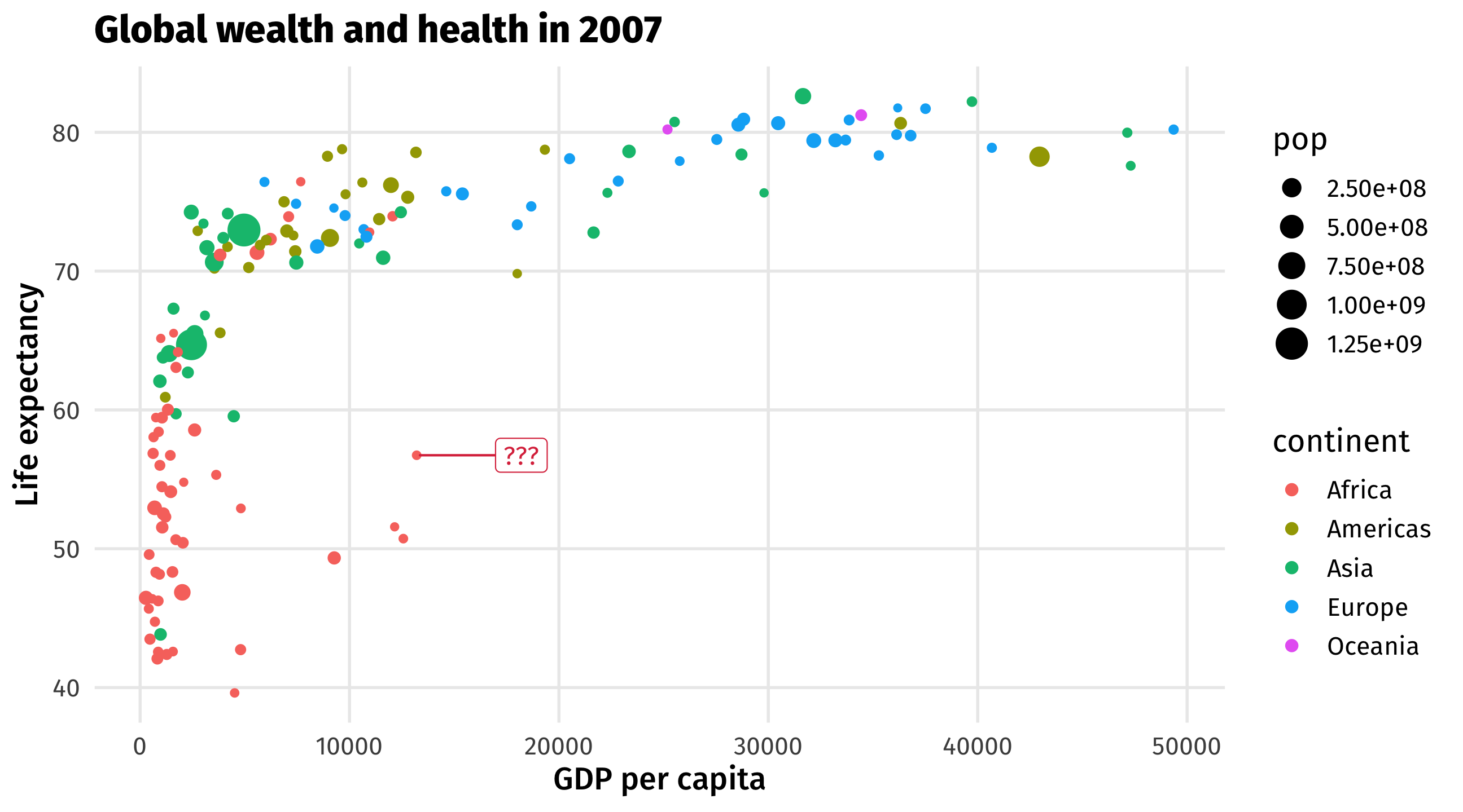
What’s going on here?
| Data | Aesthetic | Geometry |
|---|---|---|
| popular_pct | x | geom_point() |
| ec_pct | y | geom_point() |
| win_party | color | geom_point() |
| two_term | shape | geom_point() |
| winner_label | label | geom_text() |
Take your data, map it onto an aesthetic, represent with a geometry
There are many graphs out there
Each one works best in a specific context
Each one combines different aesthetics and geometries
What am I trying to show?
What kind of variables do I have?
What aesthetics and geometries do I need for this plot?
| id | age | degree | race | num_kids |
|---|---|---|---|---|
| 1 | 47 | Bachelor | White | 3 |
| 2 | 61 | High School | White | 0 |
| 3 | 72 | Bachelor | White | 2 |
| 4 | 43 | High School | White | 4 |
| 5 | 55 | Graduate | White | 2 |
| id | age | degree | race | num_kids |
|---|---|---|---|---|
| 1 | 47 | Bachelor | White | 3 |
| 2 | 61 | High School | White | 0 |
| 3 | 72 | Bachelor | White | 2 |
| 4 | 43 | High School | White | 4 |
| 5 | 55 | Graduate | White | 2 |
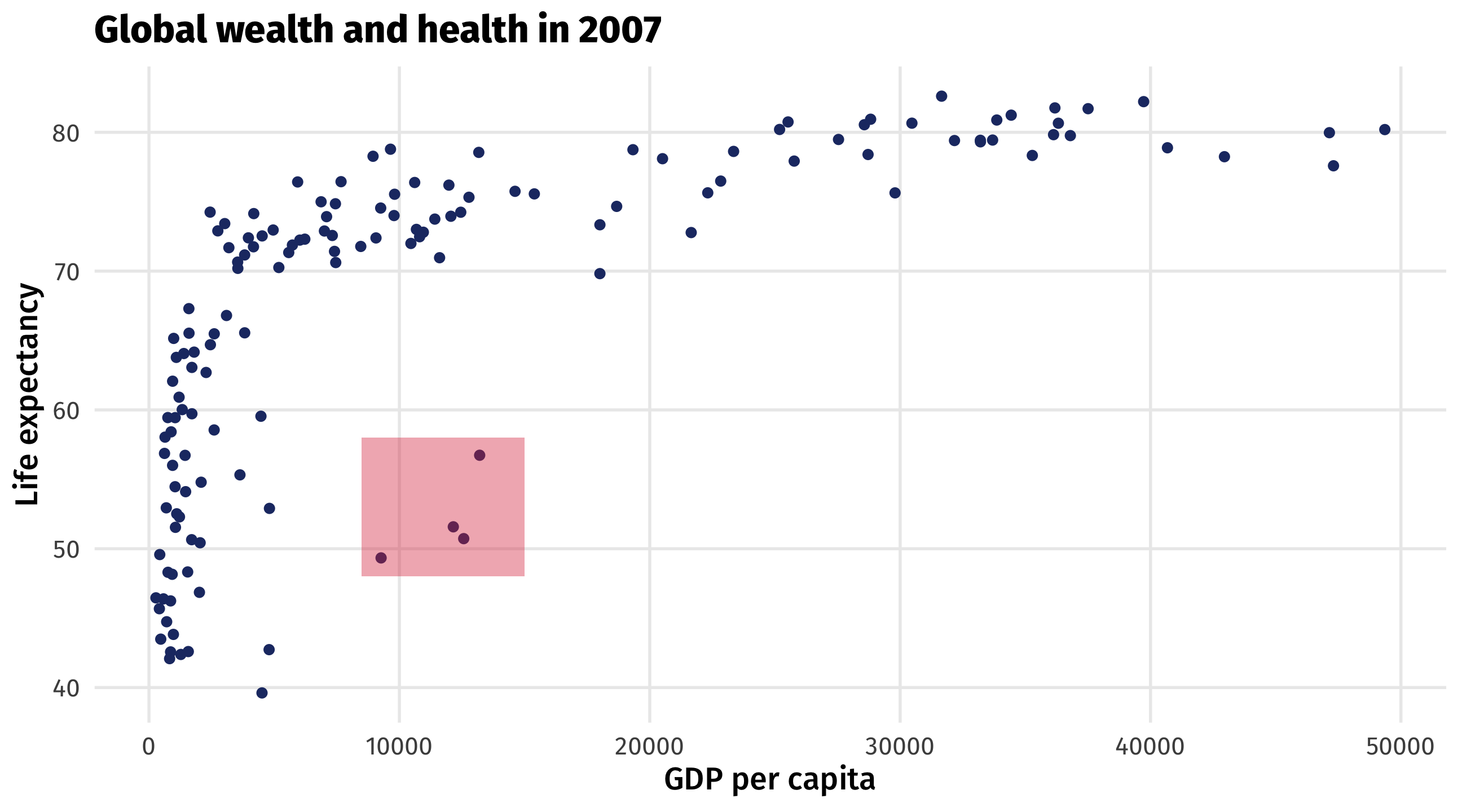
The scatterplot visualizes the relationship between two continuous variables
Shows every point in the data, reveals trends and outliers
| gdpPercap | lifeExp |
|---|---|
| 974.58 | 43.83 |
| 5937.03 | 76.42 |
| 6223.37 | 72.30 |
| 4797.23 | 42.73 |
| 12779.38 | 75.32 |
| Data | Aesthetic | Geometry |
|---|---|---|
| gdpPercap | x | geom_point() |
| lifeExp | y | geom_point() |
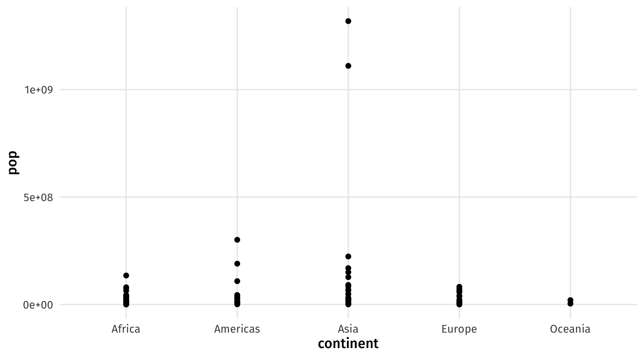
Plot is uninformative because continent is discrete (i.e., a category)
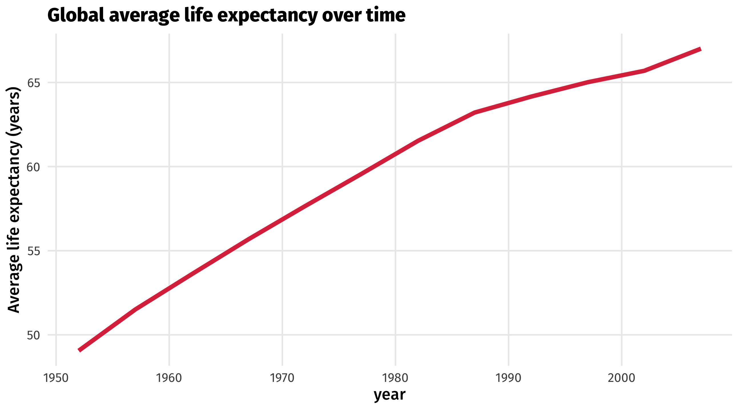
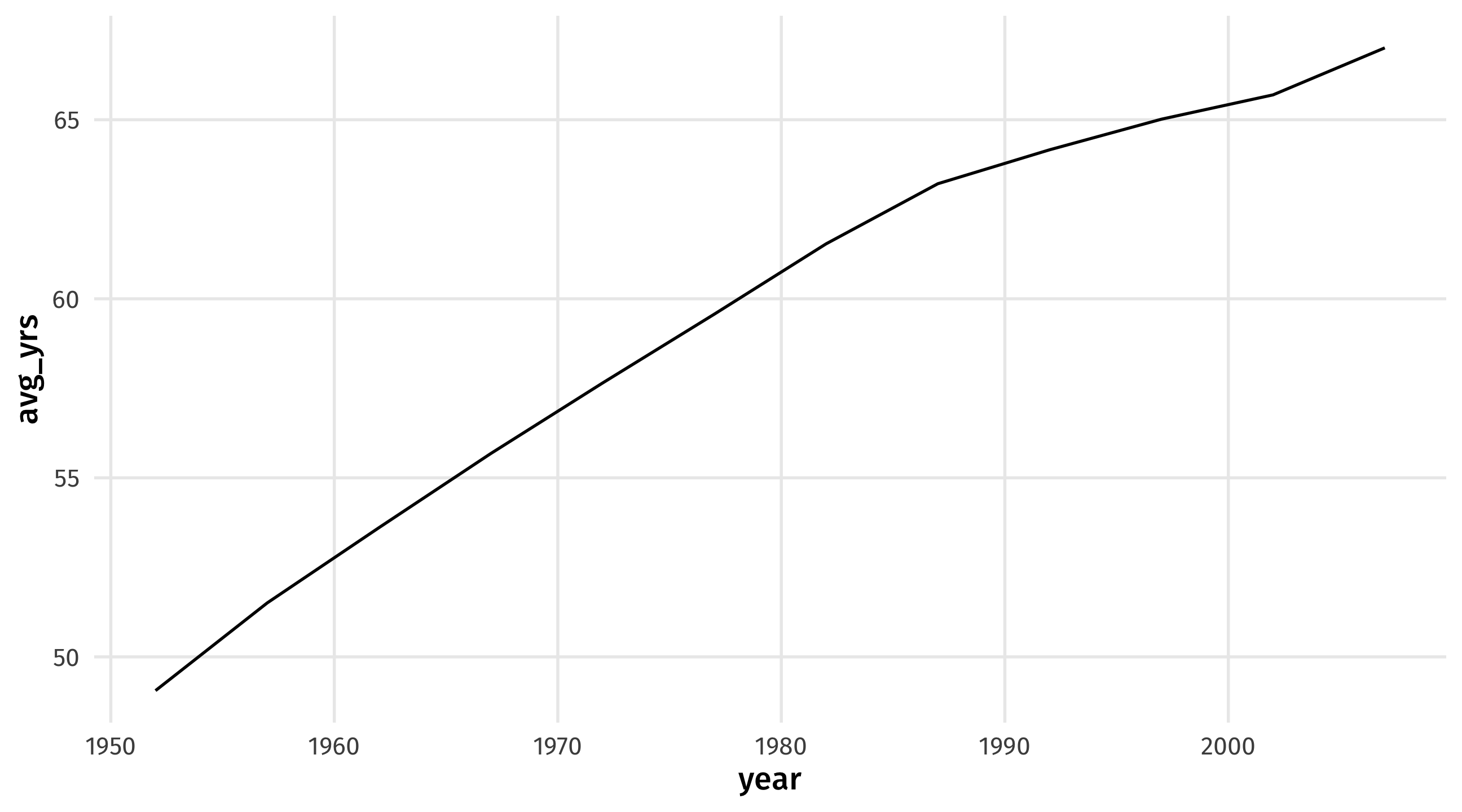
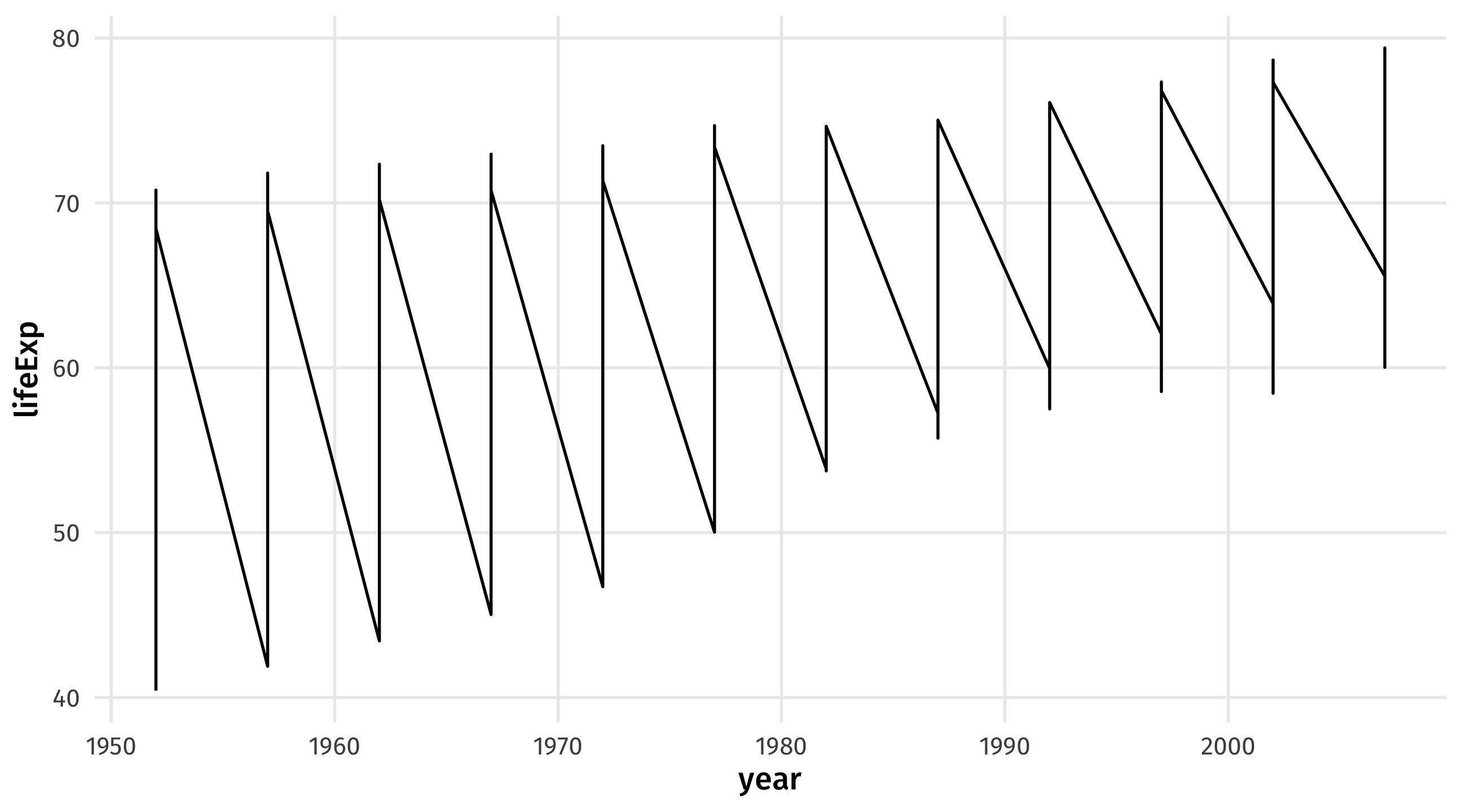
The time series uses a line to show you how a variable (y-axis) moves over time (x-axis)
| year | avg_yrs |
|---|---|
| 1952 | 49.06 |
| 1957 | 51.51 |
| 1962 | 53.61 |
| 1967 | 55.68 |
| 1972 | 57.65 |
| Data | Aesthetic | Geometry |
|---|---|---|
| year | x | geom_line() |
| avg_yrs | y | geom_line() |
Notice the new geometry, geom_line()
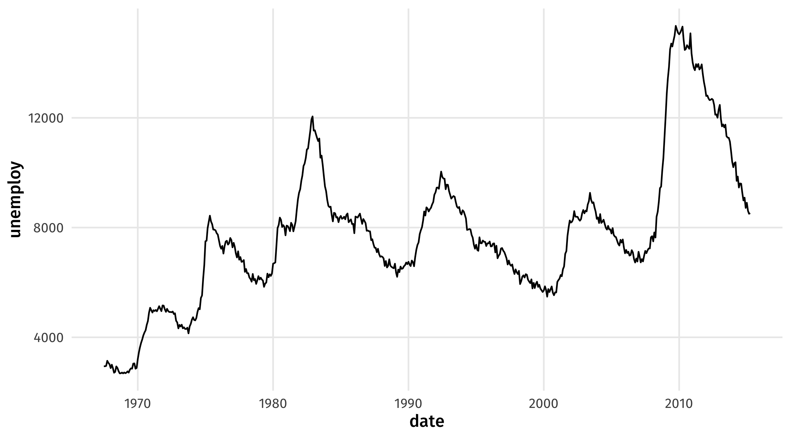
Look at the economics dataset from the tidyverse package
Type and run economics to see the data
Type and run ?economics to read about the data
Make a time series of unemployment over time
Can you identify the recessions?
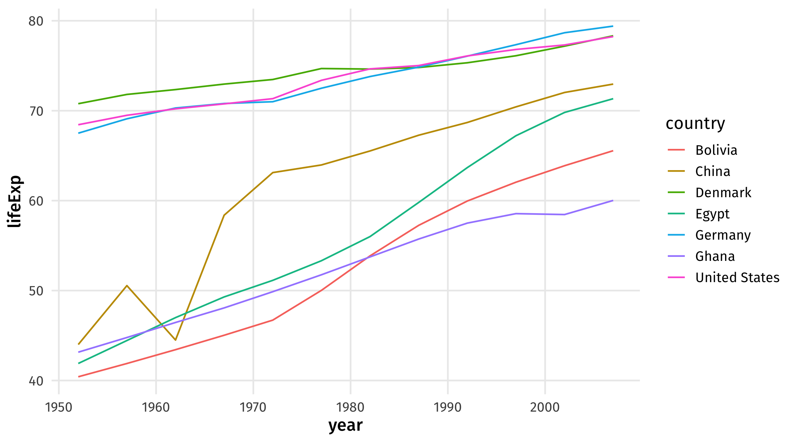
Sometimes we observe multiple units over time; how can we visualize these?
| country | continent | year | lifeExp | pop | gdpPercap |
|---|---|---|---|---|---|
| Bolivia | Americas | 1987 | 57.251 | 6156369 | 2753.6915 |
| United States | Americas | 1977 | 73.380 | 220239000 | 24072.6321 |
| Ghana | Africa | 1992 | 57.501 | 16278738 | 925.0602 |
| China | Asia | 1997 | 70.426 | 1230075000 | 2289.2341 |
| United States | Americas | 1997 | 76.810 | 272911760 | 35767.4330 |
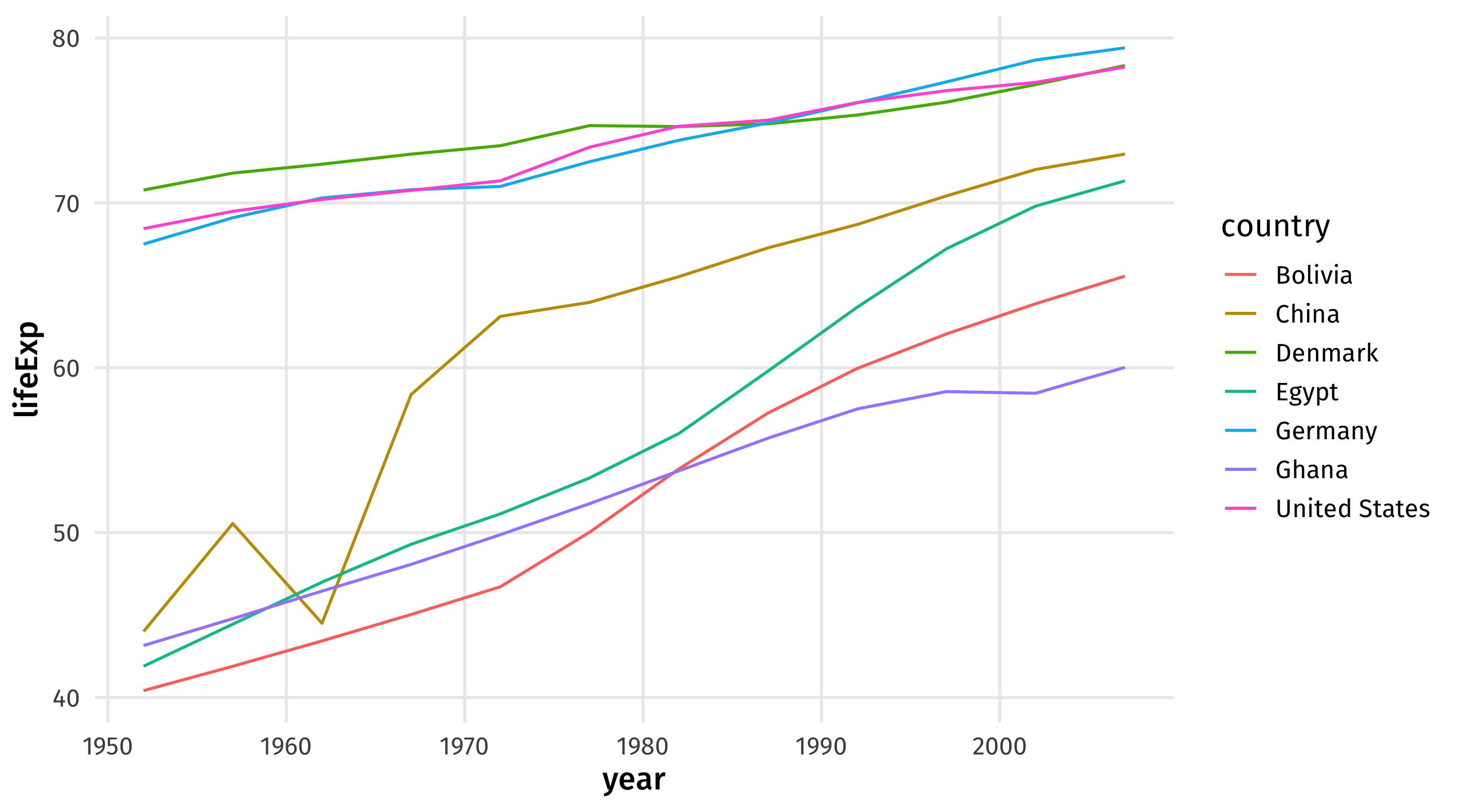
color to separate linesThese are useful for comparing trends across units (countries, places, people, etc)
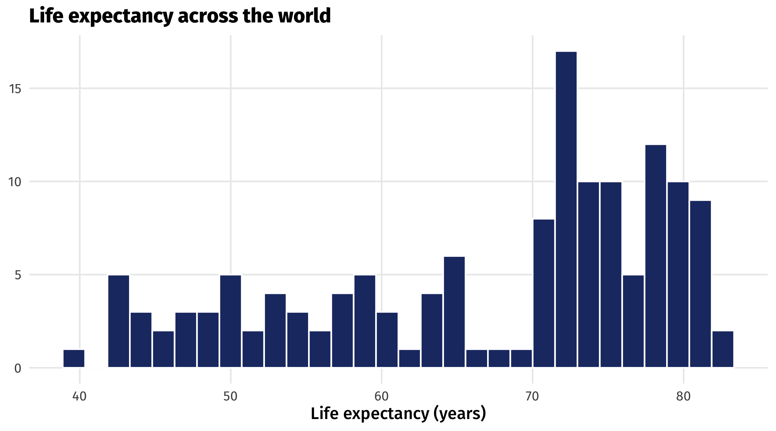
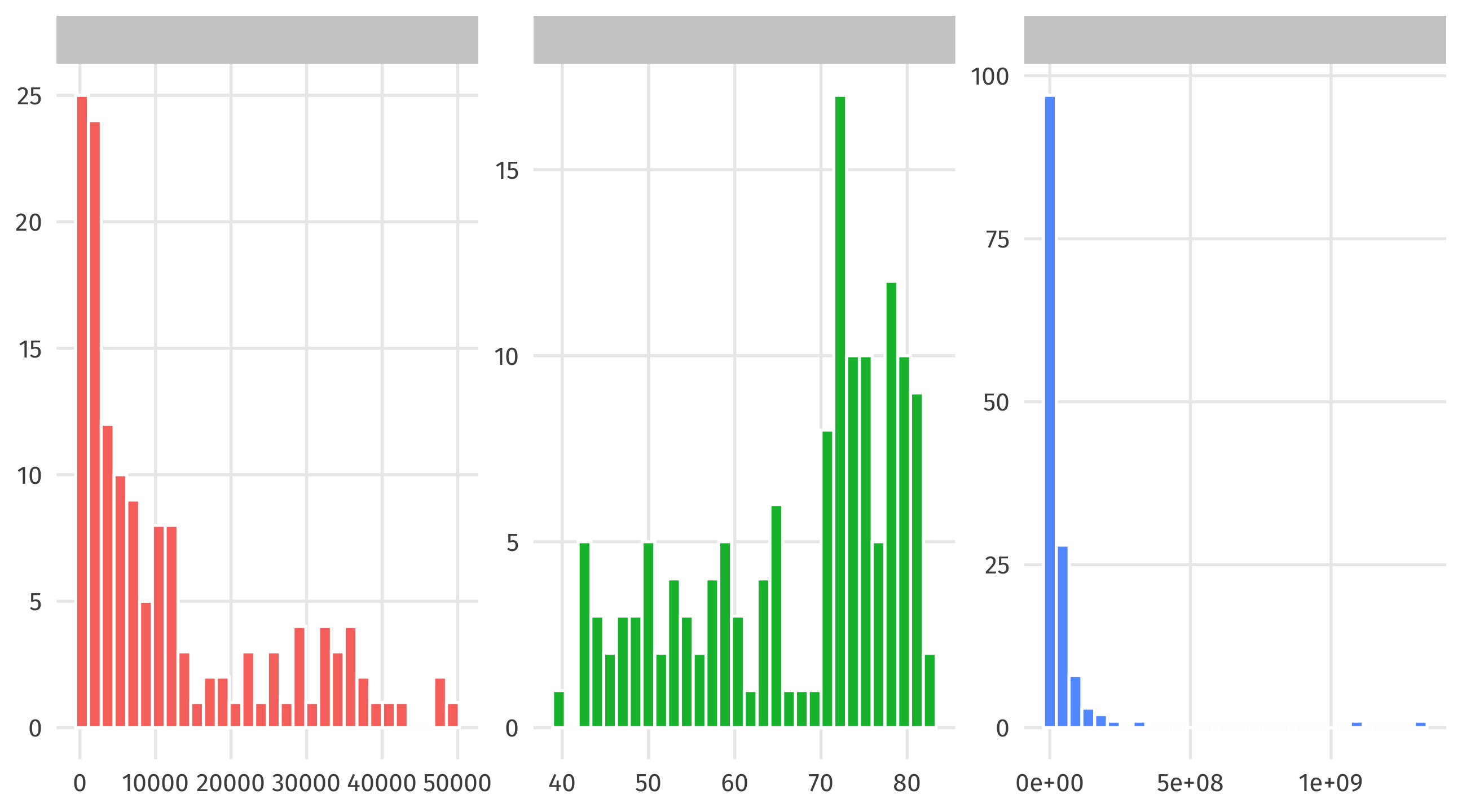
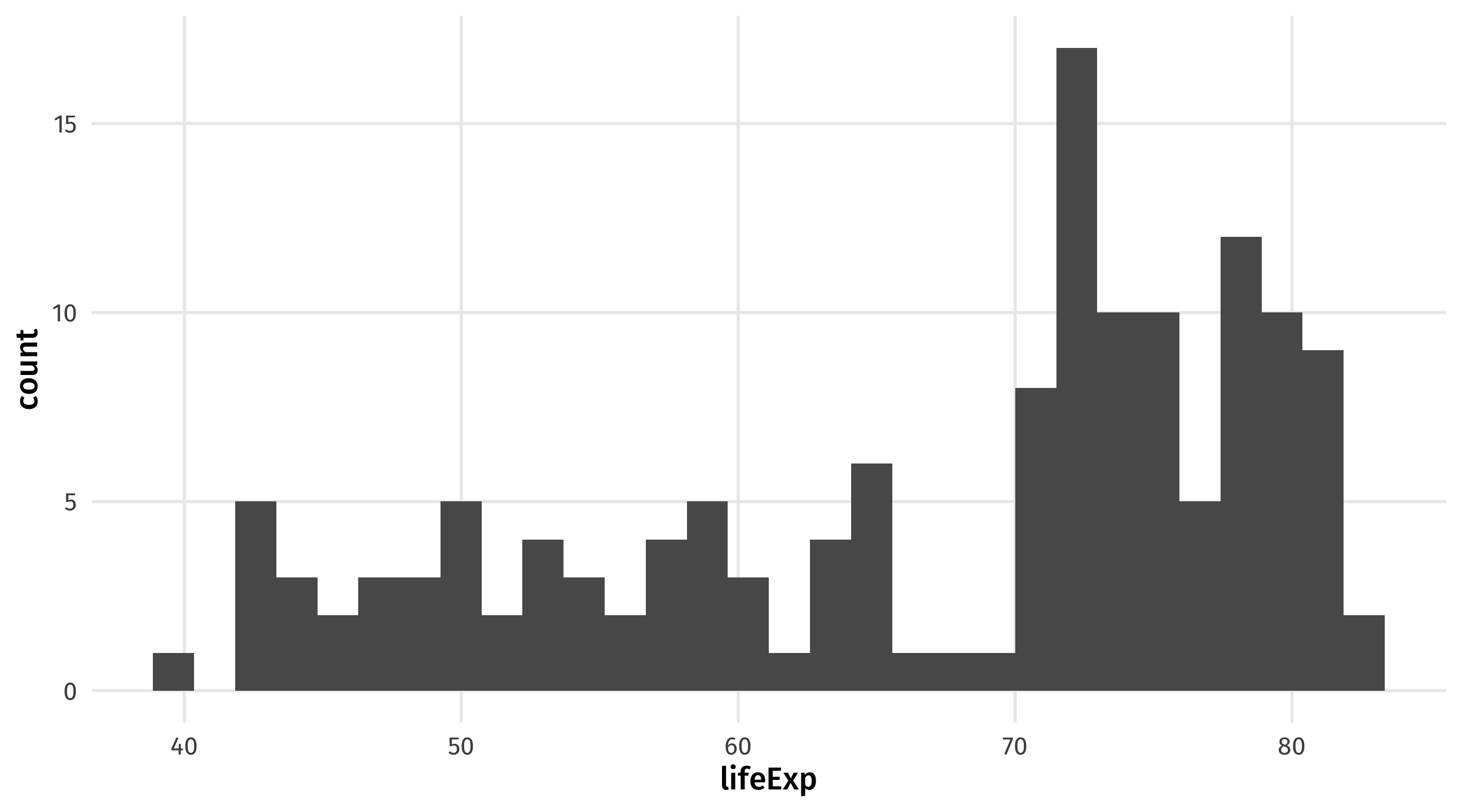
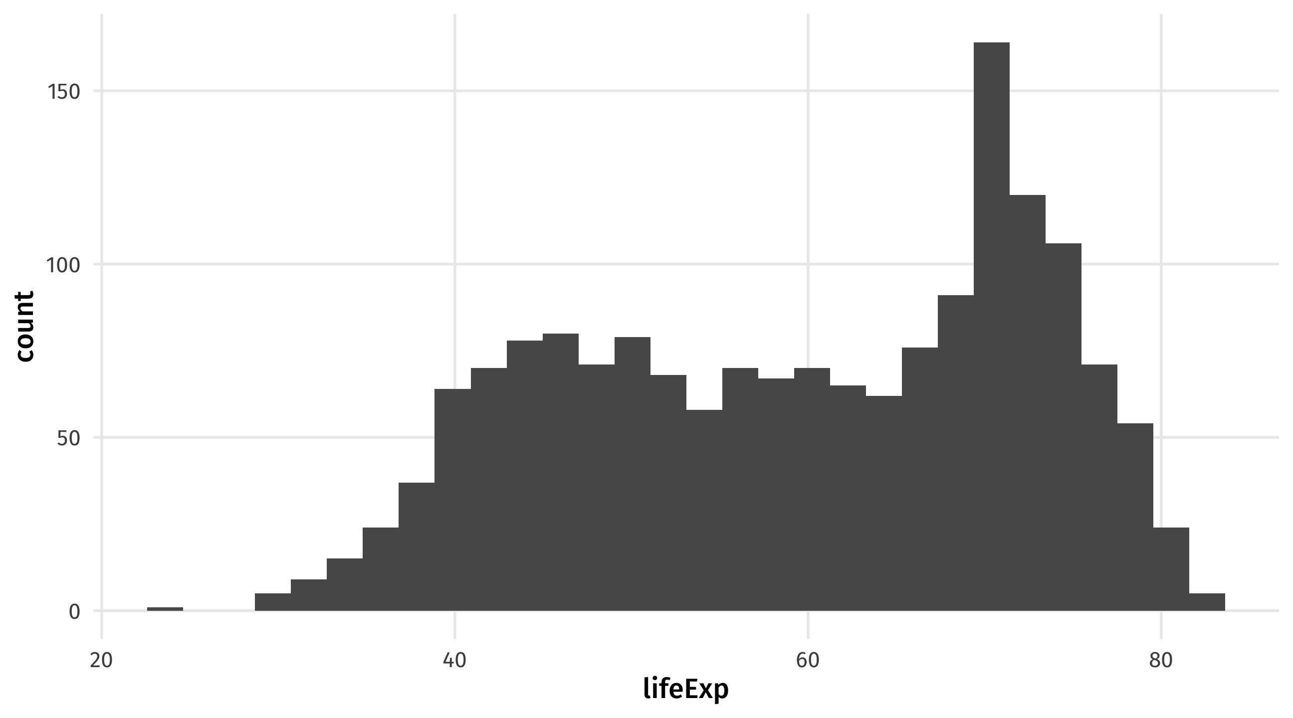
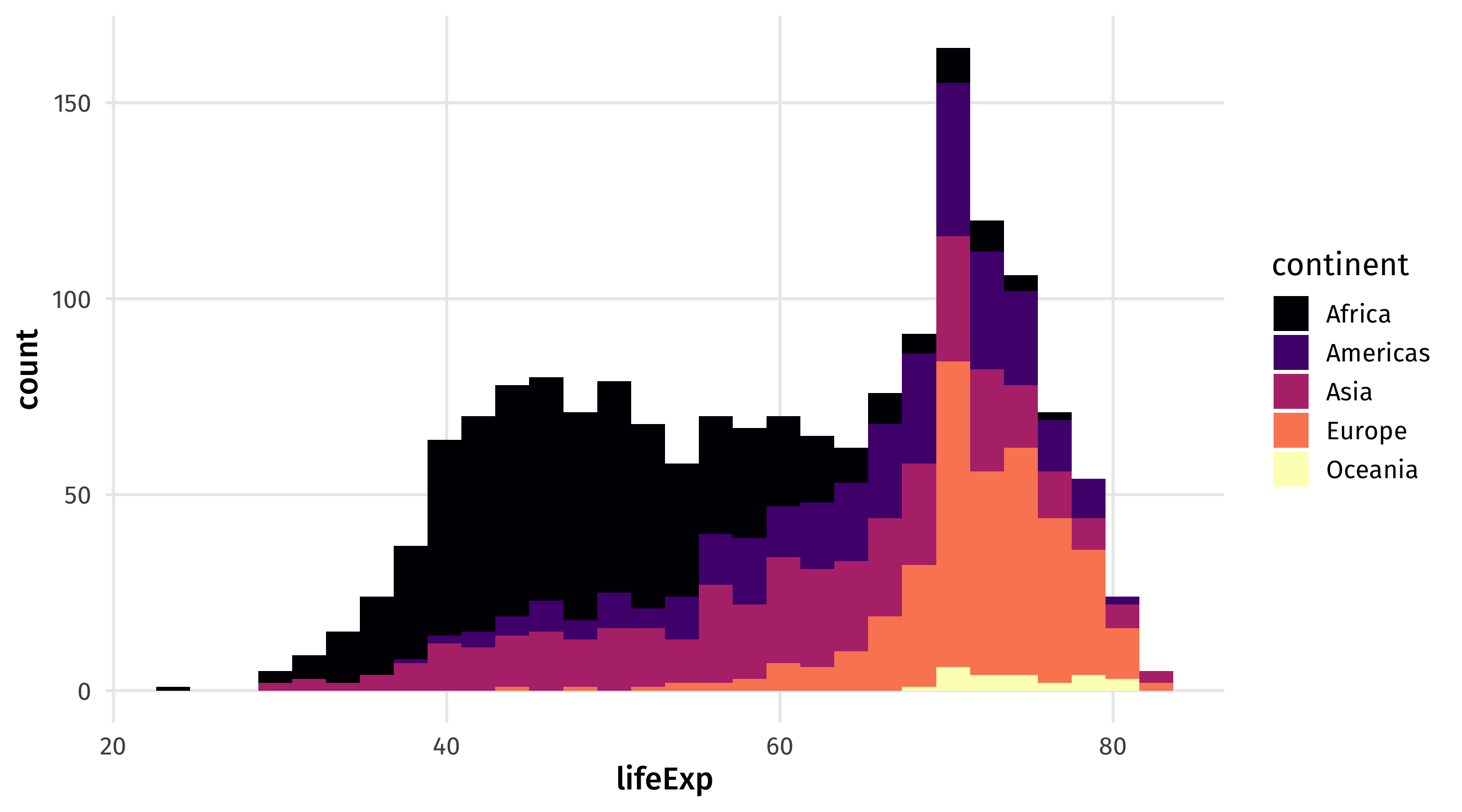
A histogram shows you how a continuous variable is distributed
| lifeExp |
|---|
| 43.83 |
| 76.42 |
| 72.30 |
| 42.73 |
| 75.32 |
| Data | Aesthetic | Geometry |
|---|---|---|
| lifeExp | x | geom_histogram() |
Notice the new geometry, geom_histogram(); and that a histogram only uses the x-axis!
In some countries, when you die it is assumed you want to donate your organs
To not donate, you have to opt out
In other countries, when you die it is assumed you do not want to donate your organs
To not donate, you have to opt in
| country | donors | opt |
|---|---|---|
| Finland | 17.1 | NA |
| Denmark | 12.9 | In |
| Austria | 25.9 | Out |
| Austria | 23.9 | Out |
| Italy | 10.1 | In |
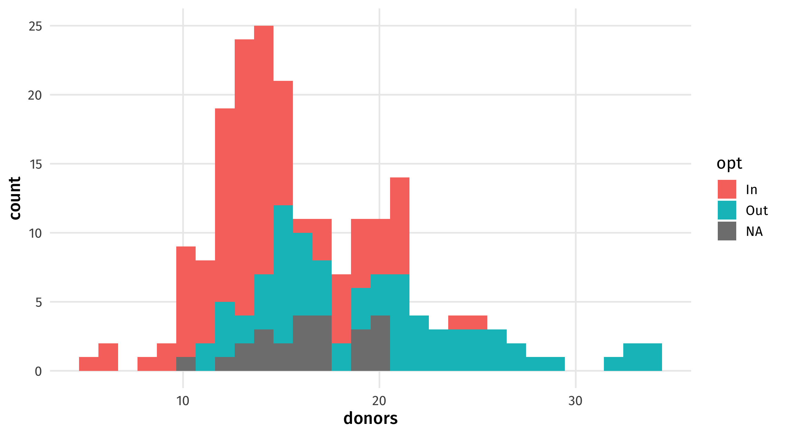
Using the organdata dataset:
Make a histogram of country’s organ donation rate (donors)
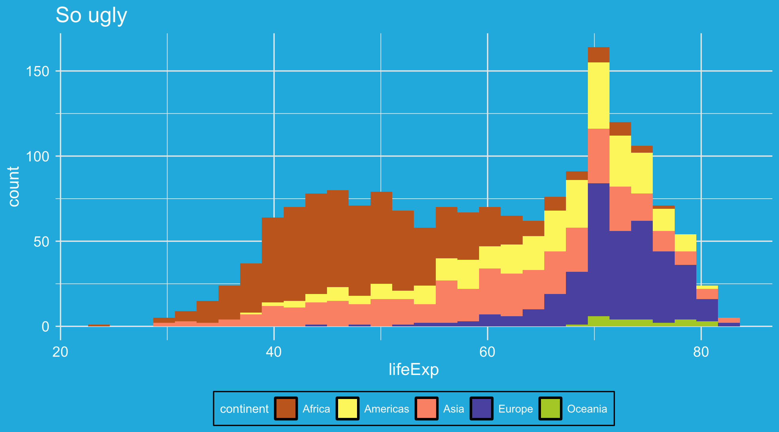
Then set the fill aesthetic to opt, whether donors have to opt in or opt out of donating. How does the graph change?
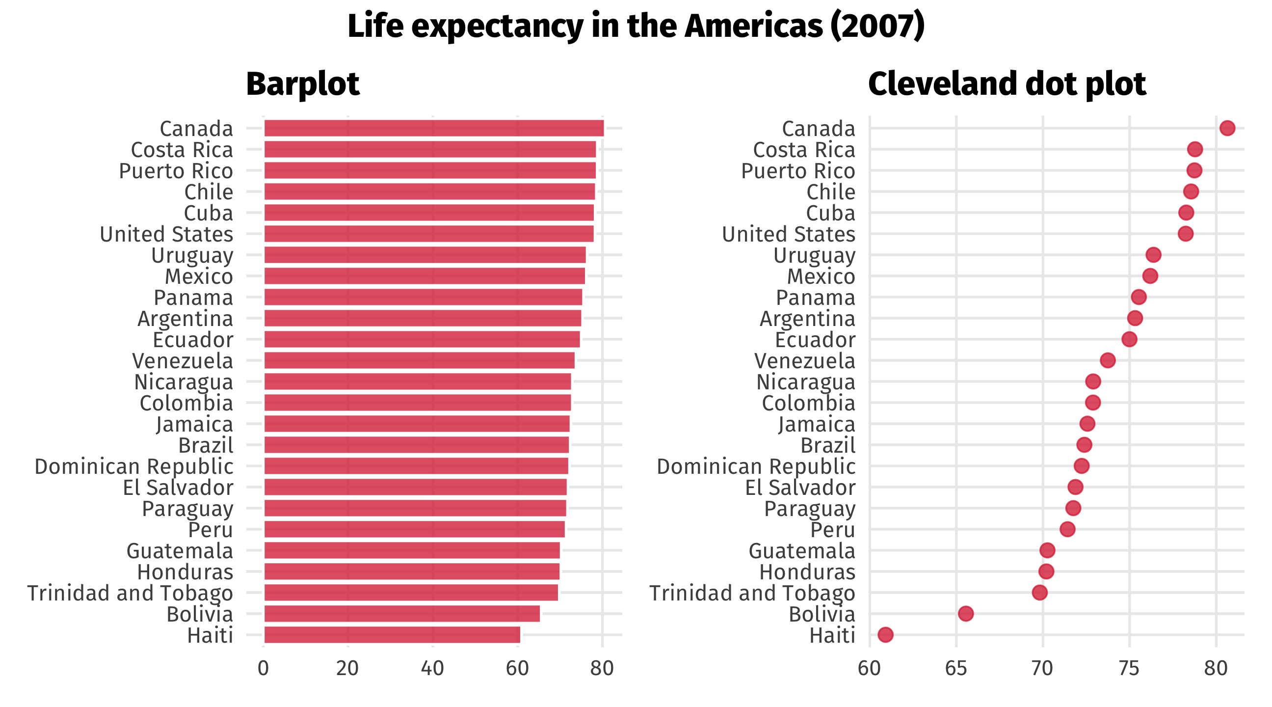
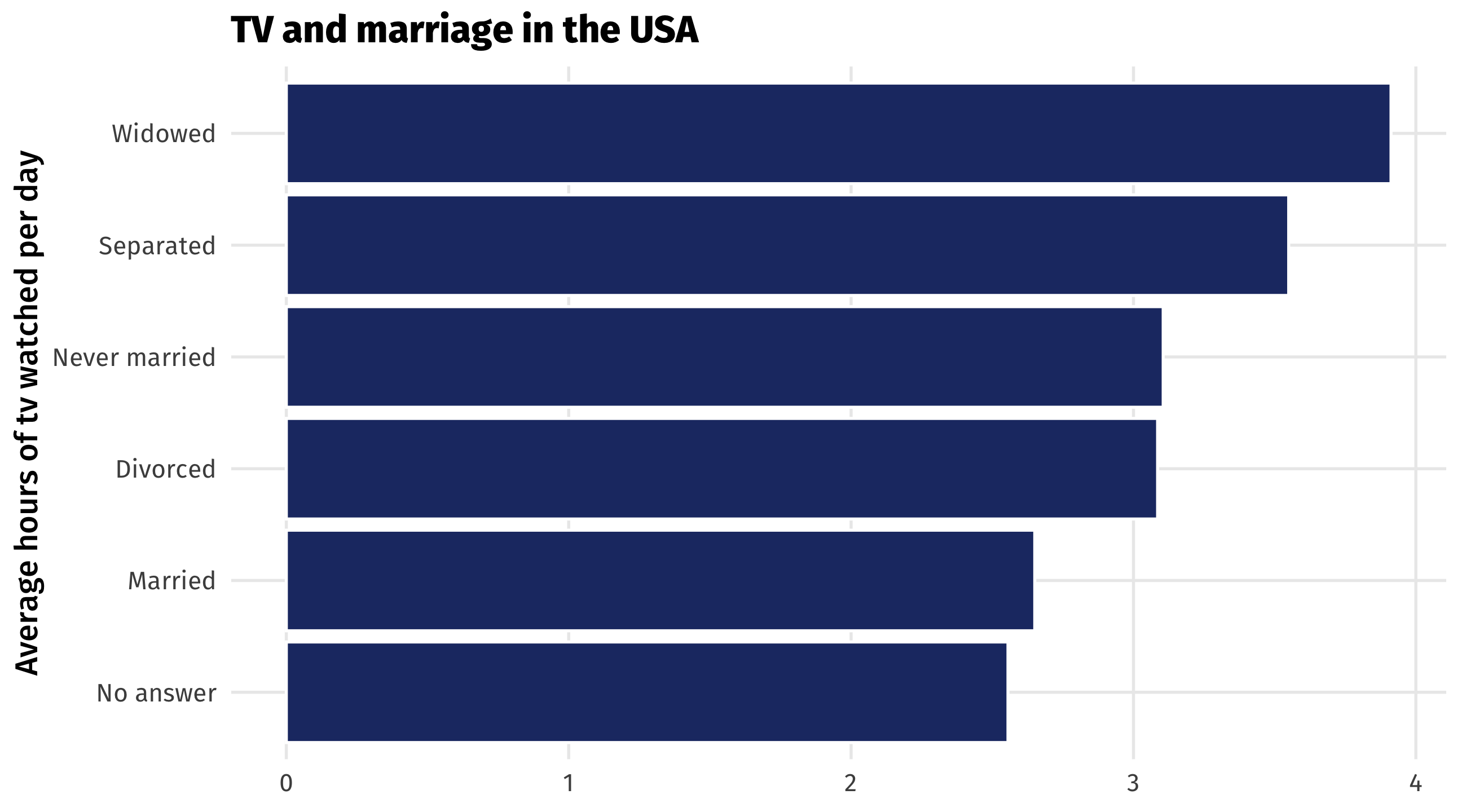
Barplots place a category (place, country, person, etc) on one axis and a quantity (amount, average, median, etc.) on another
Useful for making comparisons, highlighting differences
| marital | tv |
|---|---|
| No answer | 2.56 |
| Never married | 3.11 |
| Separated | 3.55 |
| Divorced | 3.09 |
| Widowed | 3.91 |
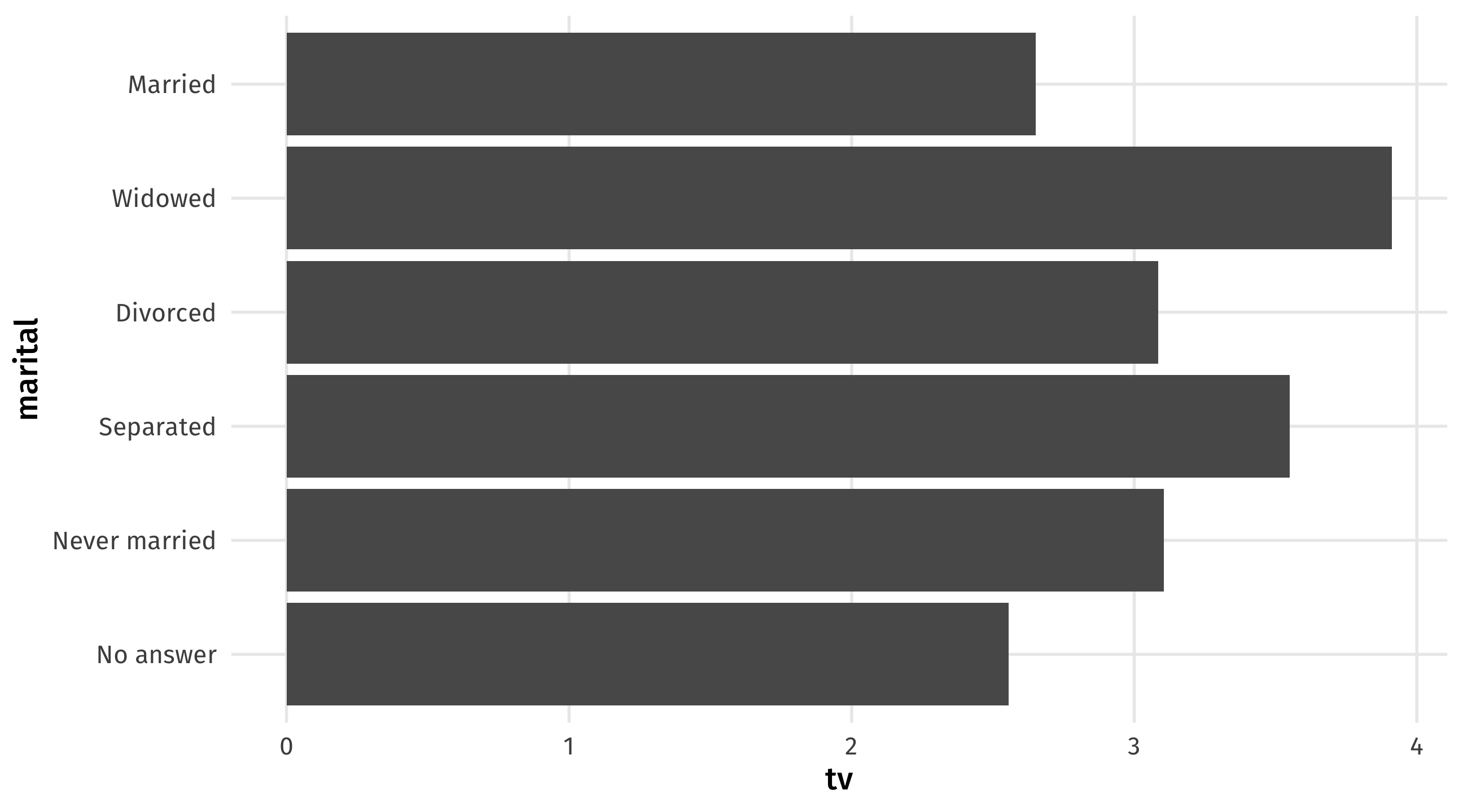
| Data | Aesthetic | Geometry |
|---|---|---|
| tv | x | geom_col() |
| marital | y | geom_col() |
Note
You could switch the x and y mapping around, but I think categories look better on the y-axis
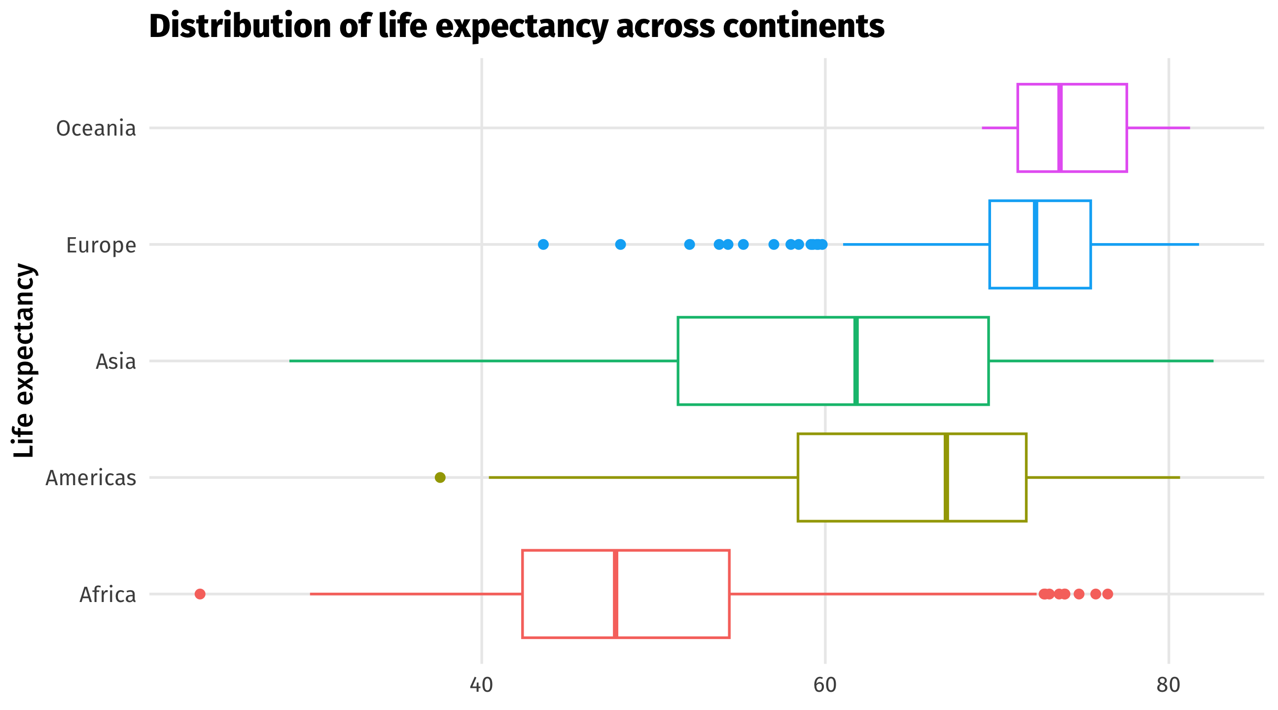
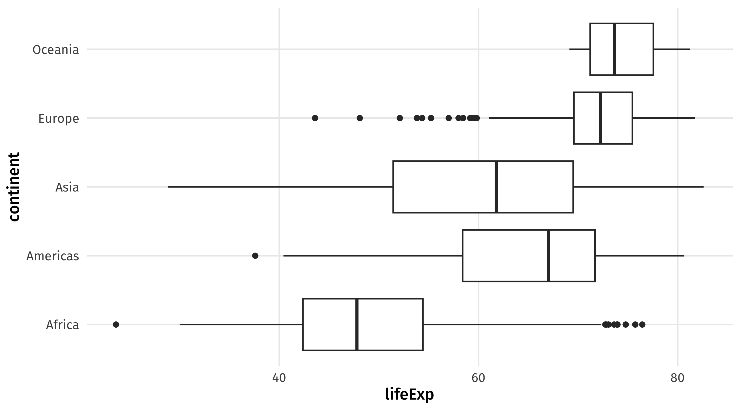
Boxplots compare distributions of continuous variables across groups
Boxplots contain a lot of info 🥵:

| continent | lifeExp |
|---|---|
| Asia | 43.83 |
| Europe | 76.42 |
| Africa | 72.30 |
| Africa | 42.73 |
| Americas | 75.32 |
| Data | Aesthetic | Geometry |
|---|---|---|
| contient | y | geom_boxplot() |
| lifeExp | x | geom_boxplot() |
Note
You could switch the x and y mapping around, but I think categories look better on the y-axis
| Graph | aes() | geom_ | Purpose |
|---|---|---|---|
| Scatterplot | x = cause, y = effect | point() | Relationships |
| Time series | x = date, y = variable | line() | Trends |
| Histogram | x = cont. variable | histogram() | Distributions |
| Barplot | y = category, x = quantity | col() | Compare amounts |
| Boxplot | y = category, x = cont. variable | boxplot() | Compare distributions |
Know how and when to use which!
We’ve barely scratched the surface; there’s many more aesthetics, geometries, and layers in ggplot()
Here are some of my favorite ones
And some ideas for making graphs better
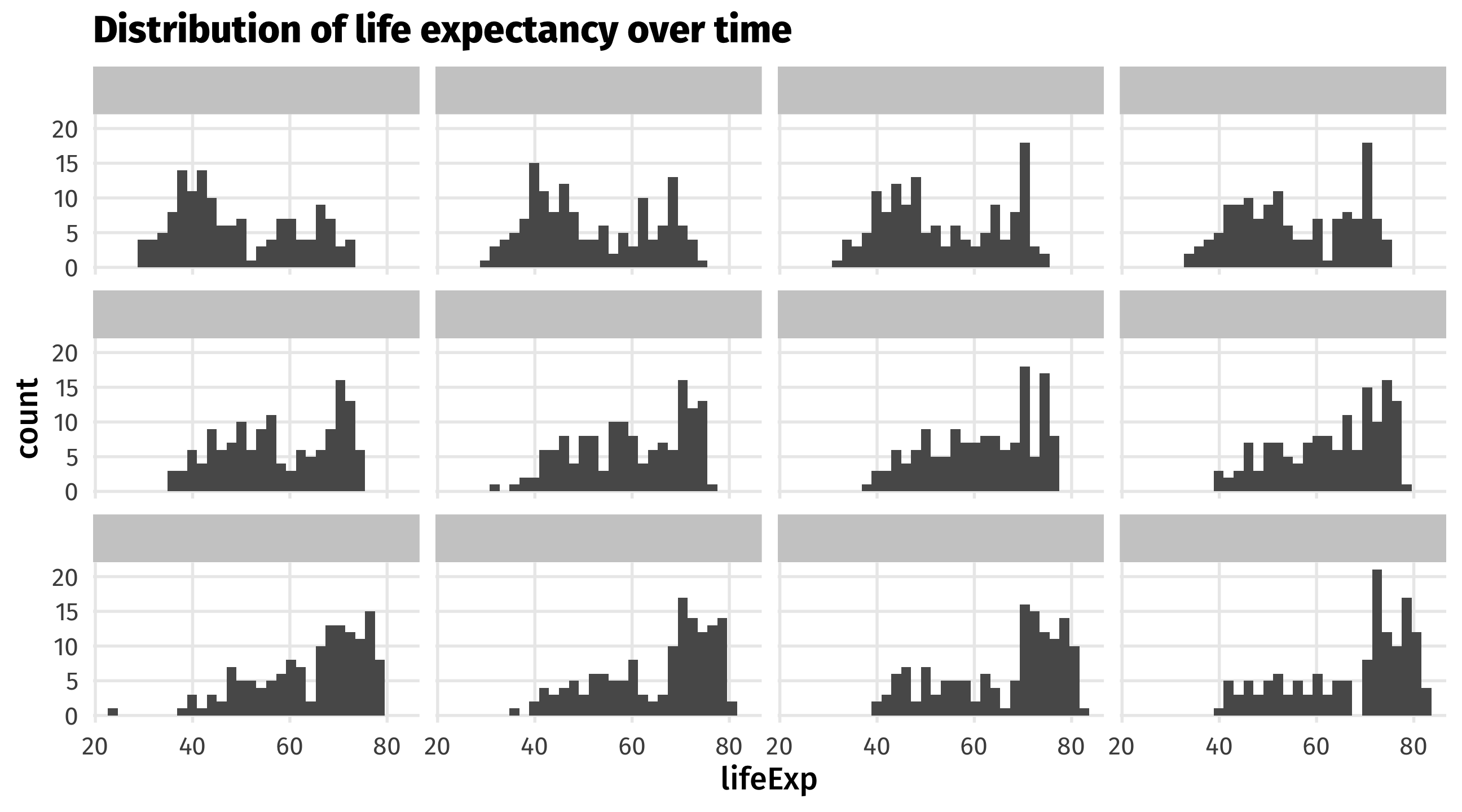
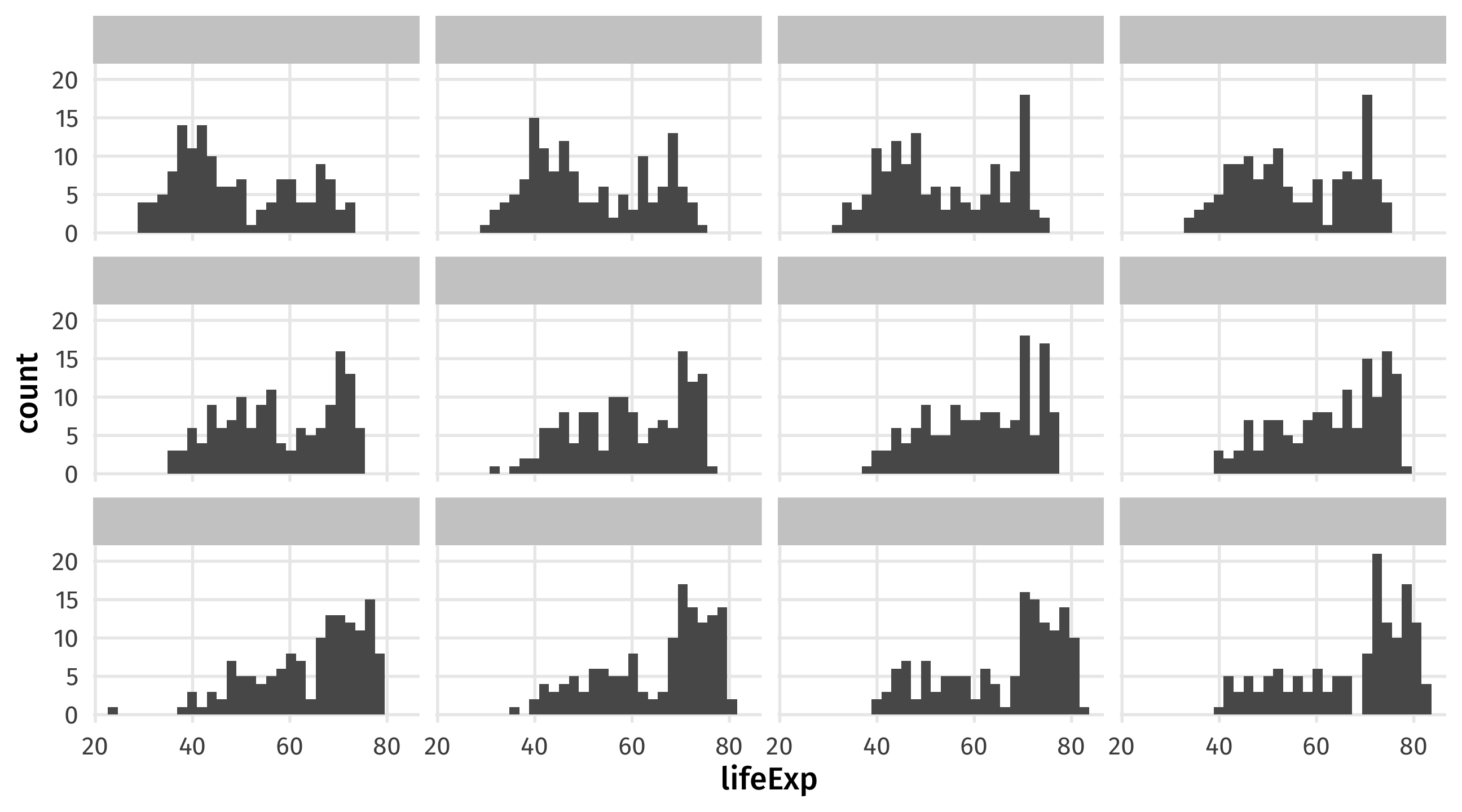
We can use panels to show movement of a variable across time, space, etc.
Note
Make sure the facetting variable is wrapped in vars()!
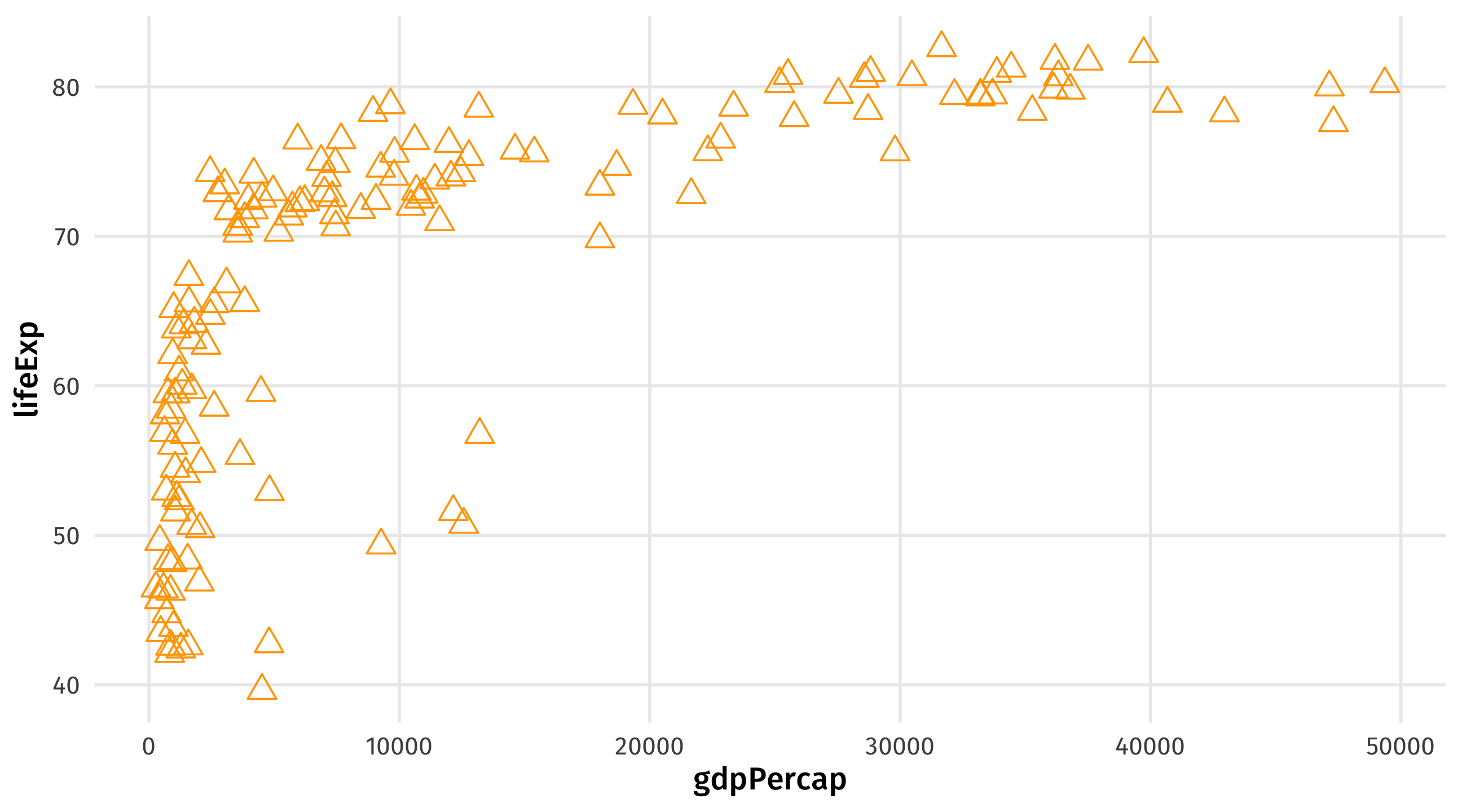
Take your aesthetics out of aes() and into geom() to make them static
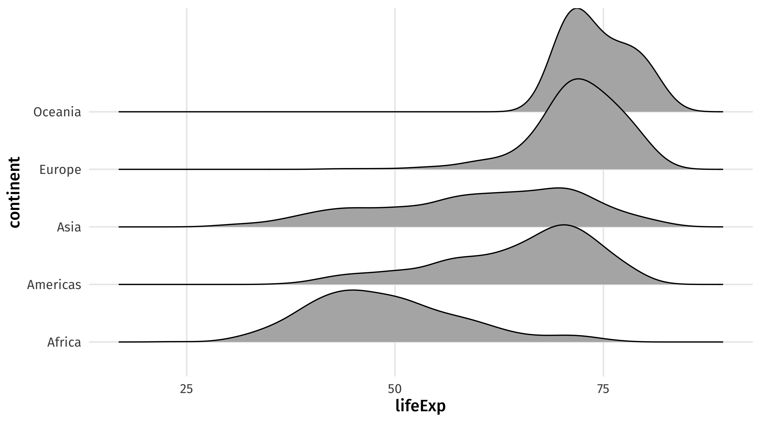
Ease visual comparison + kinda looks like the Joy Division album
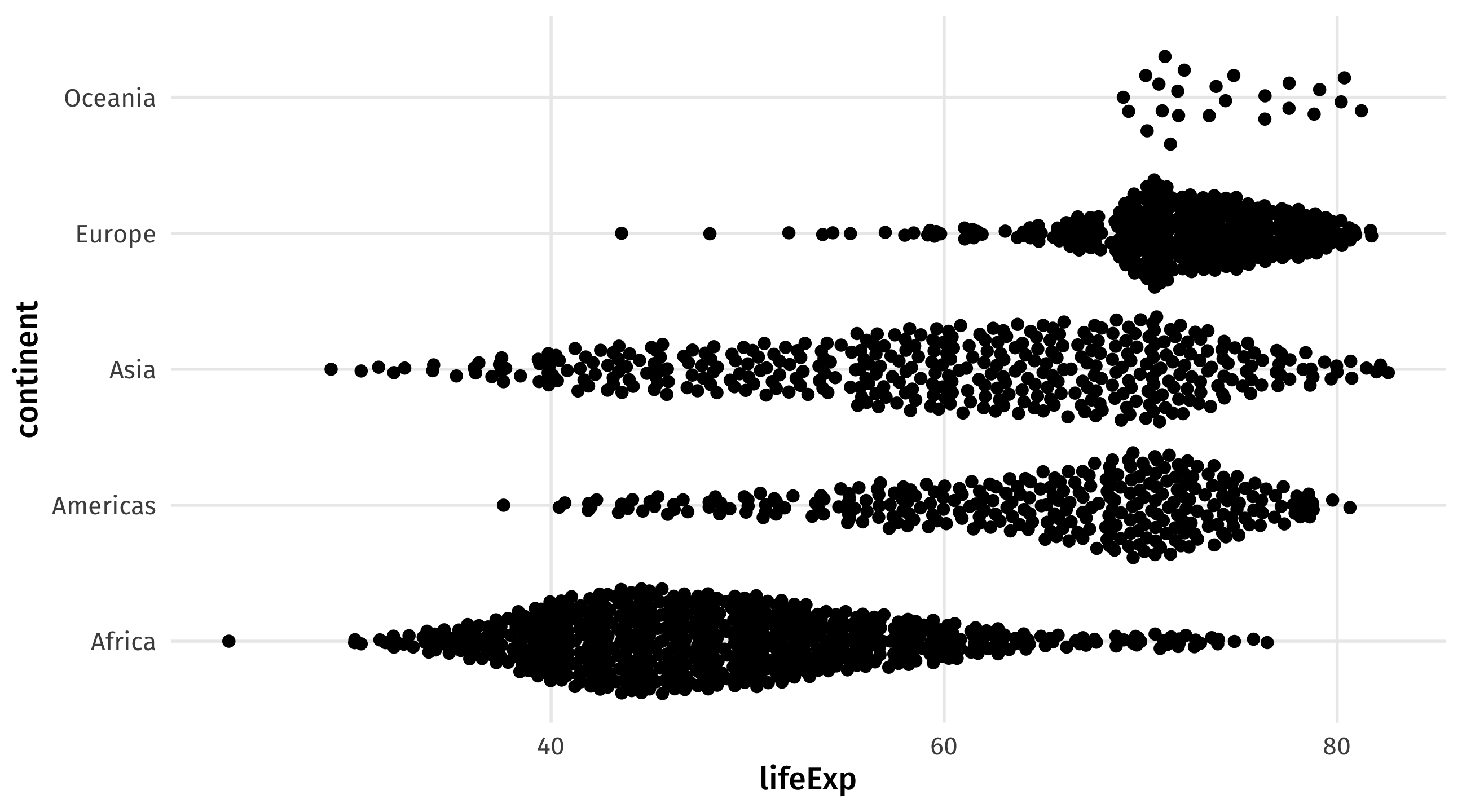
Beeswarm plots tell us something boxplots don’t: the number observations by group; used recently by the NYT
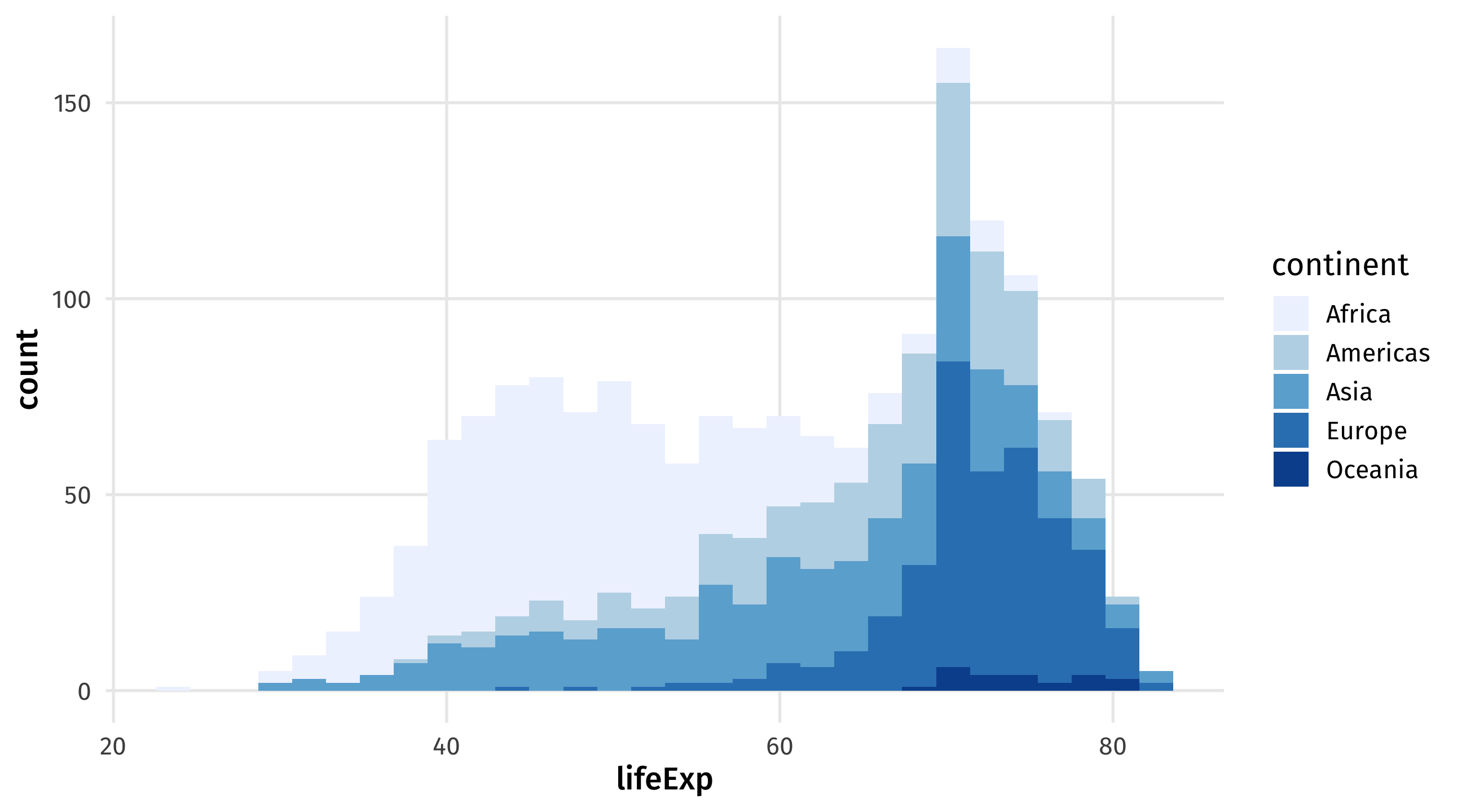
scale_fill_brewer() for fill, scale_color_brewer for color
scale_fill_viridis_d for discrete variables, scale_fill_viridis_d for continuous
theme_spongeBob() from tvthemes package, many more online