| age | \(\overline{age}\) | \(\ age_{i} - \overline{age}\) | child | \(\overline{child}\) | \(\ child_{i} - \overline{child}\) | product |
|---|---|---|---|---|---|---|
| 26 | 49.16 | -23.16 | 0 | 1.85 | -1.85 | 42.89 |
| 62 | 49.16 | 12.84 | 3 | 1.85 | 1.15 | 14.74 |
| 44 | 49.16 | -5.16 | 2 | 1.85 | 0.15 | -0.76 |
Correlations
Quantifying correlation
Correlations are used to understand a relationship between two variables. We use the following equation to quantify correlations:
\[r = \frac{ \sum_{i=1}^{n}(x_i-\bar{x})(y_i-\bar{y}) }{\sqrt{\sum_{i=1}^{n}(x_i-\bar{x})^2\sum_{i=1}^{n}(y_i-\bar{y})^2}}\]
ranges from -1 to 1,
perfectly correlated = 1 or -1,
perfectly uncorrelated = 0
All of the movement is here: \(\sum_{i=1}^{n}(x_i-\bar{x})(y_i-\bar{y})\)
\[\sum_{i=1}^{n}(age_i-\overline{age})(child_i-\overline{child})\]
Lots of big, positive products \(\rightarrow\) strong positive correlation
Lots of big, negative products \(\rightarrow\) strong negative correlation
Important
It is important to understand that correlations DO NOT say anything about how much Y changes when X changes. Rather, it only describes the ‘relationship’ between two variables.
Correlations can describe two things: direction and strength of a relationship.
Direction (+/-)
A positive correlation means that when one variable increases another variable increases as well.
A negative correlation means that when one variable goes up another variable decreases.
Strength
Correlations range from -1.0 to +1.0.
The closer it is to +1 or -1, the more closely the two variables are related. (Strong)
If the correlation is close to 0, it means there is no relationship.
Furthermore, to describe correlations we look at the direction (positive or negative) and strength (the number)
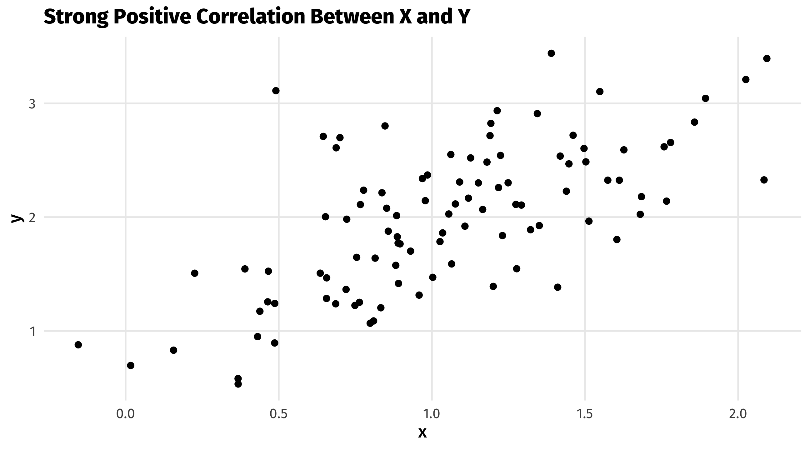
Strong: the relationship is very consistent
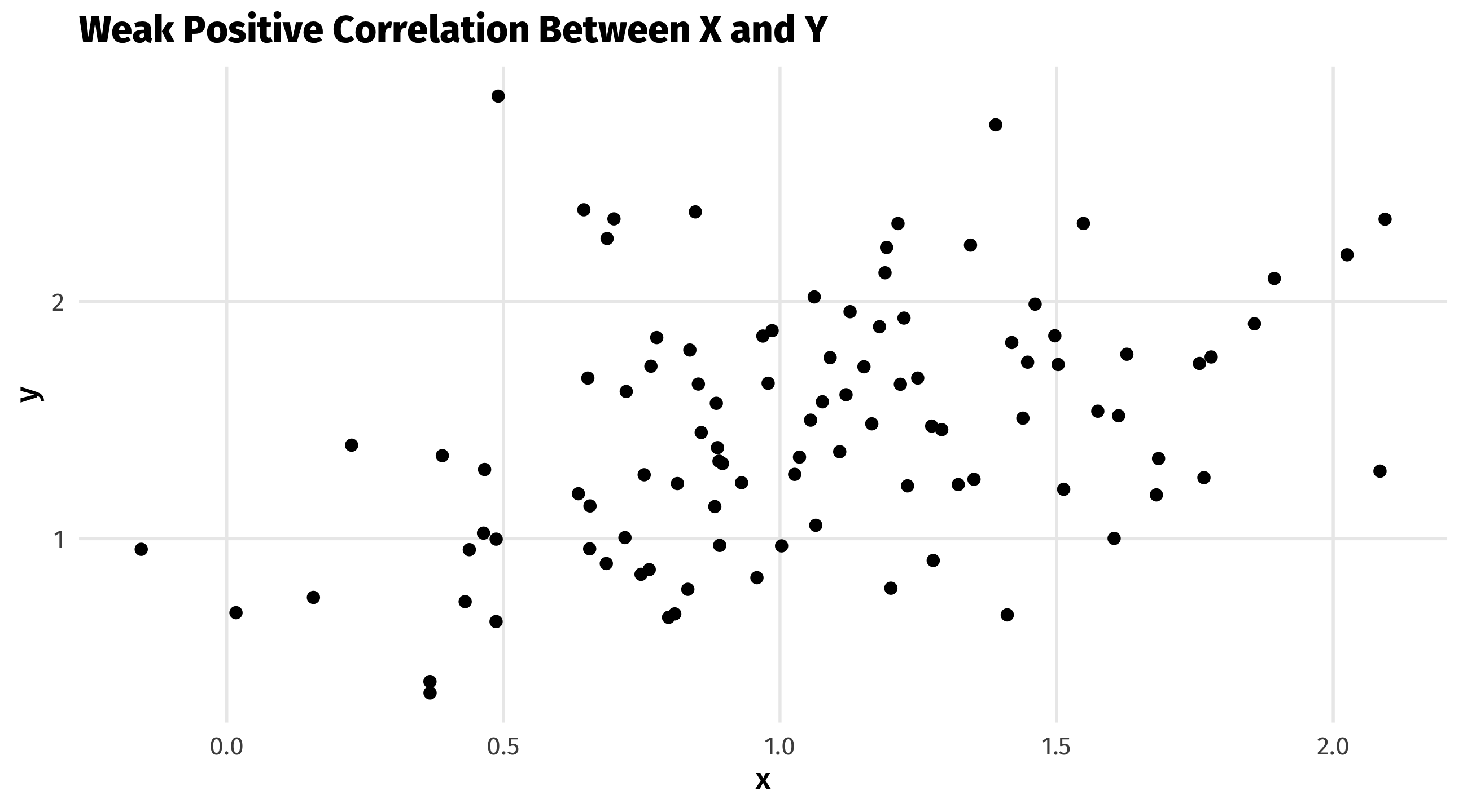
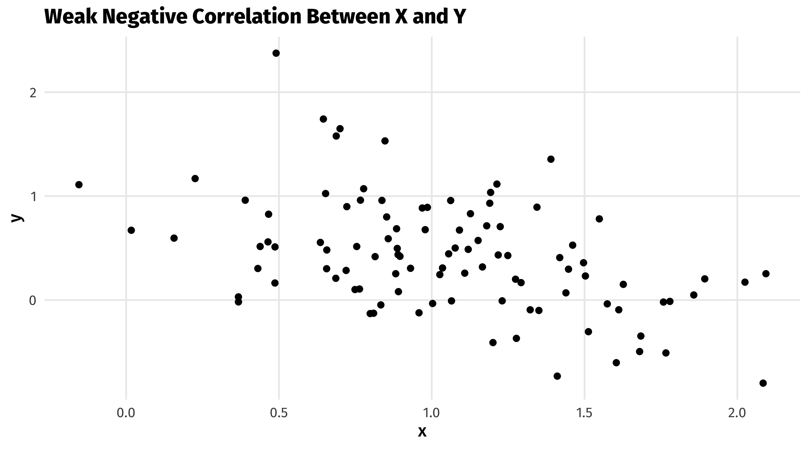
Weak: the relationship exists, but is not very strong or consistent
Positive: when one variable increases, the other tends to increase
Negative: when one variable increases, the other tends to decrease
Warning
REMINDER: THE NUMERICAL VALUE DOES NOT DESCRIBE HOW MUCH CHANGE JUST THE STRENGTH OF THE RELATIONSHIP.
Example 1:
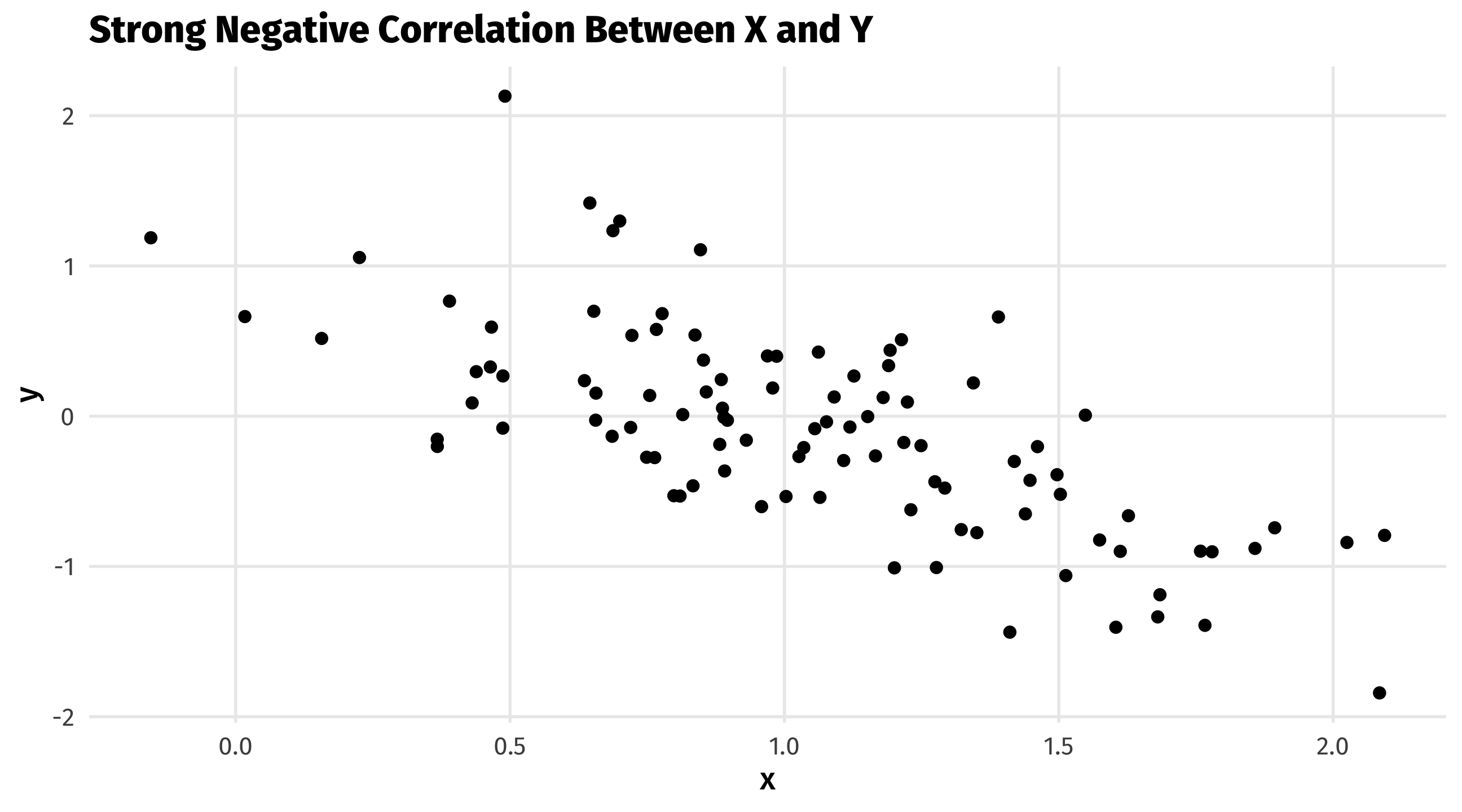
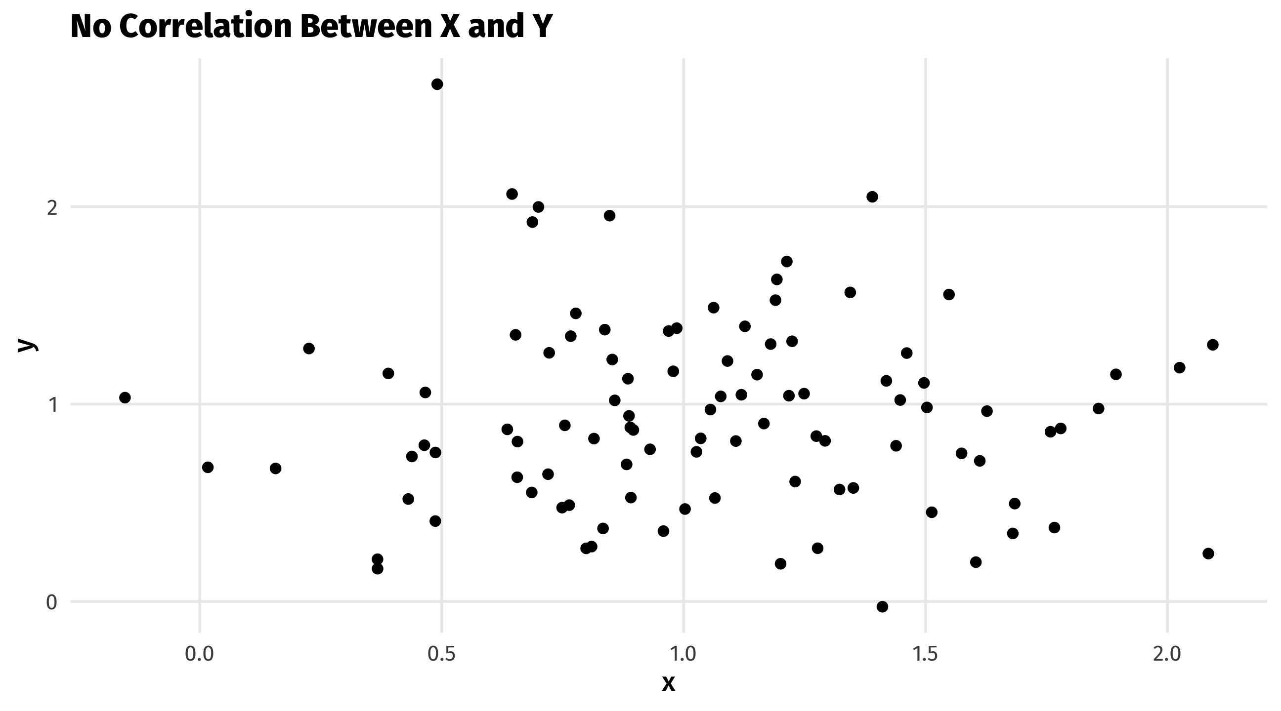
In the first example, we are looking at randomly generated data to see how we can identify correlations visually based on scatter plots. I have provided 5 examples.
Example 2:
Now in example 2, I have randomly generated data on a fake data set to understand how to use the cor() function and how to visually plot correlations to illustrate it.
  age gender   height kids    income years_edu
1  40      0 5.480122    3  73470.91        53
2  84      0 5.324767    1 135526.80       100
3  26      1 4.814127    5  51245.85        46
4  78      0 5.015744    5  95671.94        99
5  56      0 5.242842    2  97375.04        68
6  48      0 4.243953    1 100512.59        70
The cor() function allows us to calculate the correlation between two or more variables. My first example looks at only two variables and then visualizes it through a scatter plot.
[1] 0.9260033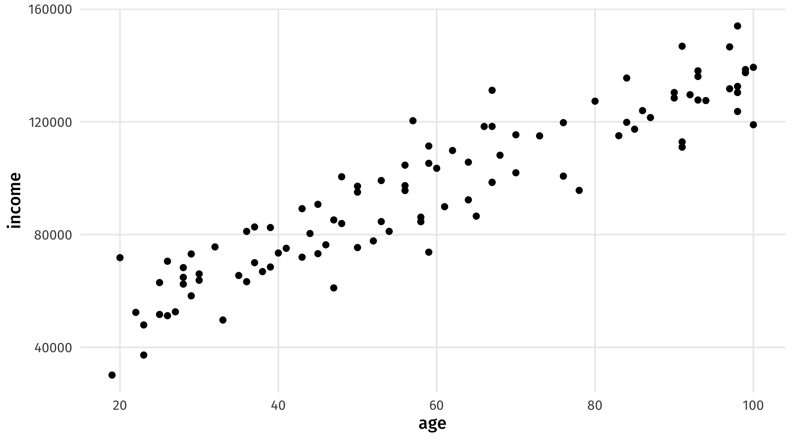
Since the correlation score is 0.89, we can determine there is a strong positive relationship between age and income, stating that as age increases, so does income, which is seen in our scatter plot as well.
Next, we will examine our full data set. Doing this only works if you have only numerical values; it does not work for non-numerical values.
                  age      gender      height        kids      income
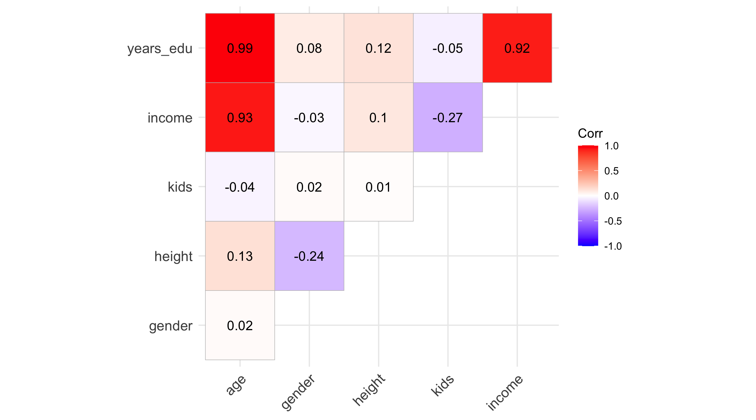
age        1.00000000  0.01613562  0.12926437 -0.04294040  0.92600327
gender     0.01613562  1.00000000 -0.24154026  0.02198794 -0.02963598
height     0.12926437 -0.24154026  1.00000000  0.01487277  0.09756631
kids      -0.04294040  0.02198794  0.01487277  1.00000000 -0.26536753
income     0.92600327 -0.02963598  0.09756631 -0.26536753  1.00000000
years_edu  0.98540459  0.08326801  0.11777500 -0.05497819  0.91578590
            years_edu
age        0.98540459
gender     0.08326801
height     0.11777500
kids      -0.05497819
income     0.91578590
years_edu  1.00000000
We can visualize this using the ggcorrplot() function.
lab = TRUEshows the correlation coefficientstype = "upper"changes the shape of visualization showing