ggplot2 is a package in R that is used for creating graphics. This package is found in the package tidyverse. To build a graph, you first need to tell r what information or data you want it to use in the function ggplot().
ggplot(data)
Next, you need to tell it what aesthetics you want it to use, which includes what x and y variables.
ggplot(data, aes(x, y)
After, you need to tell r how you want it to graph the data.
ggplot(data, aes(x, y) + geom_point()
ggplot has several different geom_ that allow you to graph various different things. We will focus on four different graphs: scatter plots, histograms, box plots, and time series.
However, we will only scratch the surface of the ggplot2 package, which includes many more commands and options (aesthetics, geoms, scales, statistics, etc.).
Scatter Plots
The first plot style we will be looking at is a scatter plot. To plot a scatter plot in ggplot you will use the format discussed above and to tell r you want it to graph a scatter plot you will use the geom function; geom_point().
library(tidyverse)
── Attaching core tidyverse packages ──────────────────────── tidyverse 2.0.0 ──
✔ dplyr     1.2.1     ✔ readr     2.2.0
✔ forcats   1.0.1     ✔ stringr   1.6.0
✔ ggplot2   4.0.3     ✔ tibble    3.3.1
✔ lubridate 1.9.5     ✔ tidyr     1.3.2
✔ purrr     1.2.2
── Conflicts ────────────────────────────────────────── tidyverse_conflicts() ──
✖ dplyr::filter() masks stats::filter()
✖ dplyr::lag()    masks stats::lag()
ℹ Use the conflicted package (<http://conflicted.r-lib.org/>) to force all conflicts to become errors
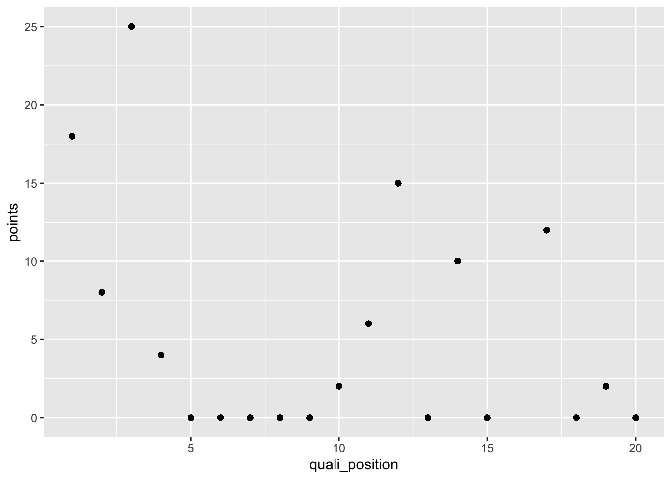
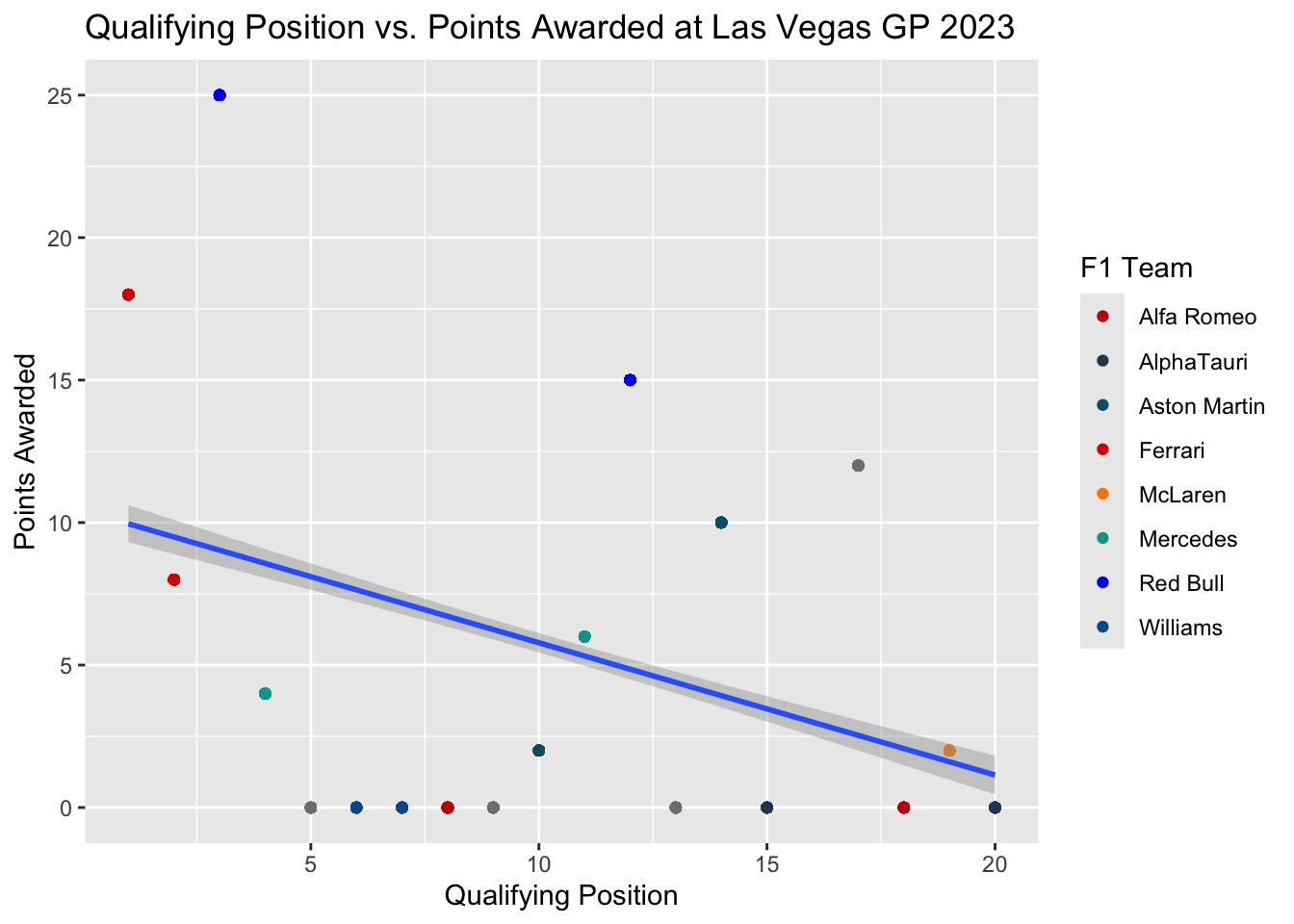
In the following example, we will plot the qualifying position for the 20 drivers and the final points they were awarded for the Las Vegas Grand Prix in 2023.
vegas_gp <- race_stats |>filter(circuit =="Las Vegas Strip Street Circuit"& year =="2023")ggplot(data = vegas_gp, aes(x = quali_position, y = points)) +geom_point()
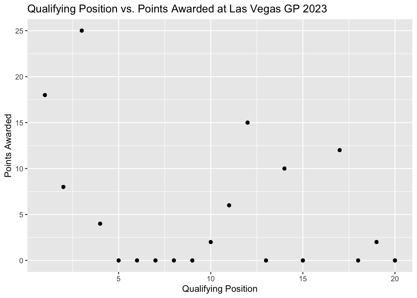
Let’s add a main title and adjust the x and y labels.
ggplot(data = vegas_gp, aes(x = quali_position, y = points)) +geom_point() +labs(x ="Qualifying Position",y ="Points Awarded",title ="Qualifying Position vs. Points Awarded at Las Vegas GP 2023" )
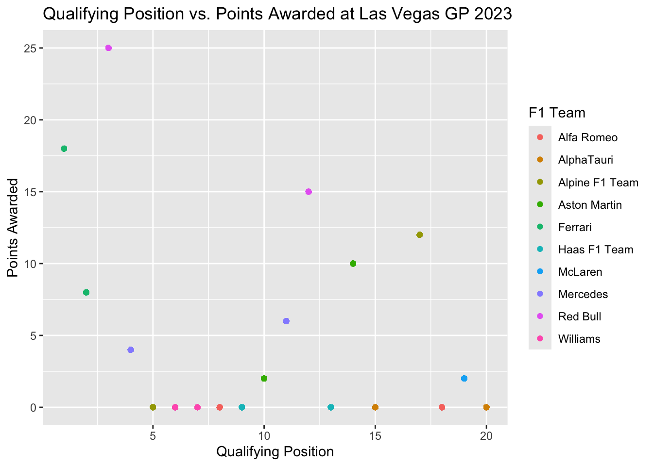
If we wanted to identify the constructors of each team we would add color = constructor in the aes().
Note
Change the name of the legend by changing the name of the grouping, in this case color, in labs().
ggplot(data = vegas_gp, aes(x = quali_position, y = points, color = constructor)) +geom_point() +labs(x ="Qualifying Position",y ="Points Awarded",title ="Qualifying Position vs. Points Awarded at Las Vegas GP 2023",color ="F1 Team" )
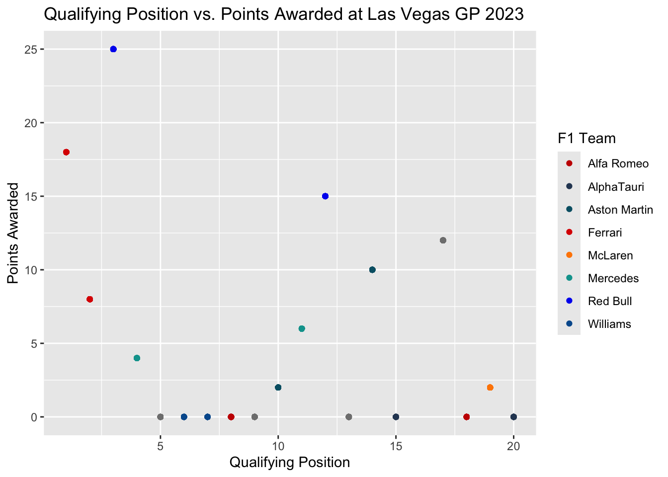
Let’s change the colors for the teams now. We can assign our own colors or we can make our own palette.
If we wanted to add a smoother line we would use the geom_smooth() and we will be fitting a linear regression line, thus inside geom_smooth() we method = "lm".
Caution
When using geom_smooth() move any groupings, like color or shape, into the geom_point() by applying the aesthetics in that part of the function.
ggplot(data = vegas_gp, aes(x = quali_position, y = points)) +geom_point(aes(color = constructor)) +labs(x ="Qualifying Position",y ="Points Awarded",title ="Qualifying Position vs. Points Awarded at Las Vegas GP 2023",color ="F1 Team" ) +scale_color_manual(values = f1_colors) +geom_smooth(method ="lm")
`geom_smooth()` using formula = 'y ~ x'
Time Series
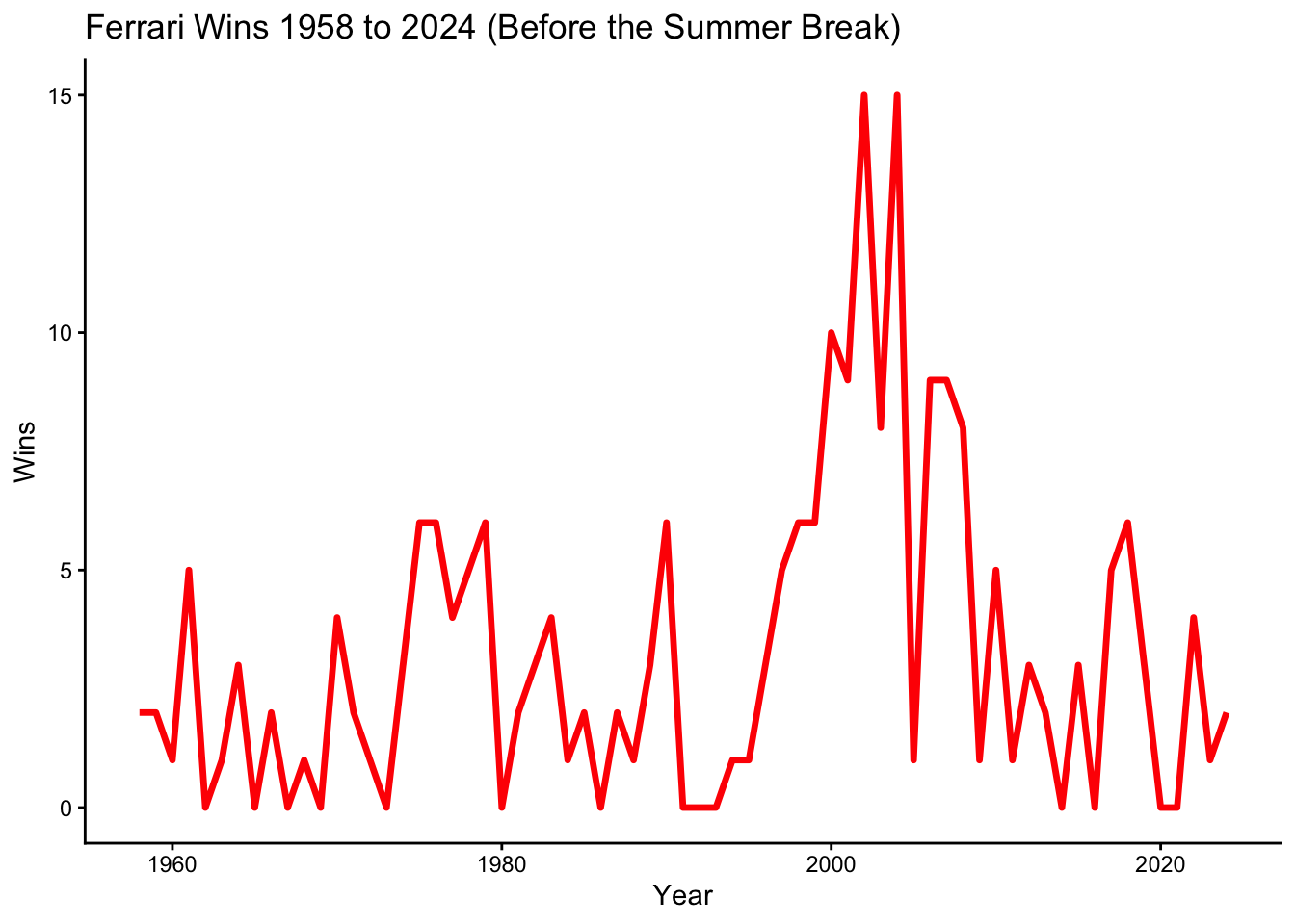
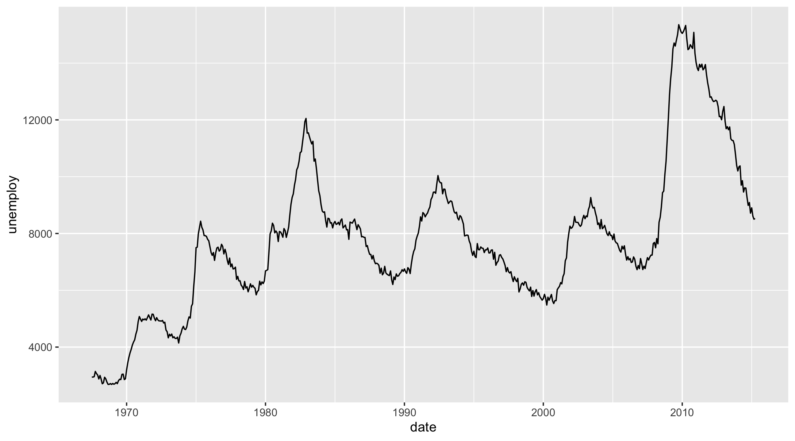
geom_line() in ggplot2 is used to create a line plot by connecting data points with a continuous line, which is ideal for visualizing trends over time. It is particularly useful for time series data because it clearly shows how a variable changes across ordered time intervals, allowing for easy identification of patterns and trends.
?constructors_stats# Calculate total wins per year for Ferrariferrari_wins <- constructors_stats |>filter(constructor =="Ferrari") |>group_by(year) |>summarize(total_wins =sum(max(constructor_wins)))ggplot(data = ferrari_wins, aes(x = year, y = total_wins)) +geom_line(color ="red", linewidth =1.2) +# Creates a red line plotlabs(title ="Ferrari Wins 1958 to 2024 (Before the Summer Break)", x ="Year", y ="Wins") +theme_classic()
aes(x = year, y = total_wins):
x = year: Puts the years on the x-axis.
y = total_wins: Puts the total number of wins on the y-axis.
geom_line(color = "red", linewidth = 1.2):
geom_line(): Creates a line plot instead of points.
color = "red": Adds a color to the line
linewidth = 1.2: Makes the line slightly thicker for better visibility.
Histograms
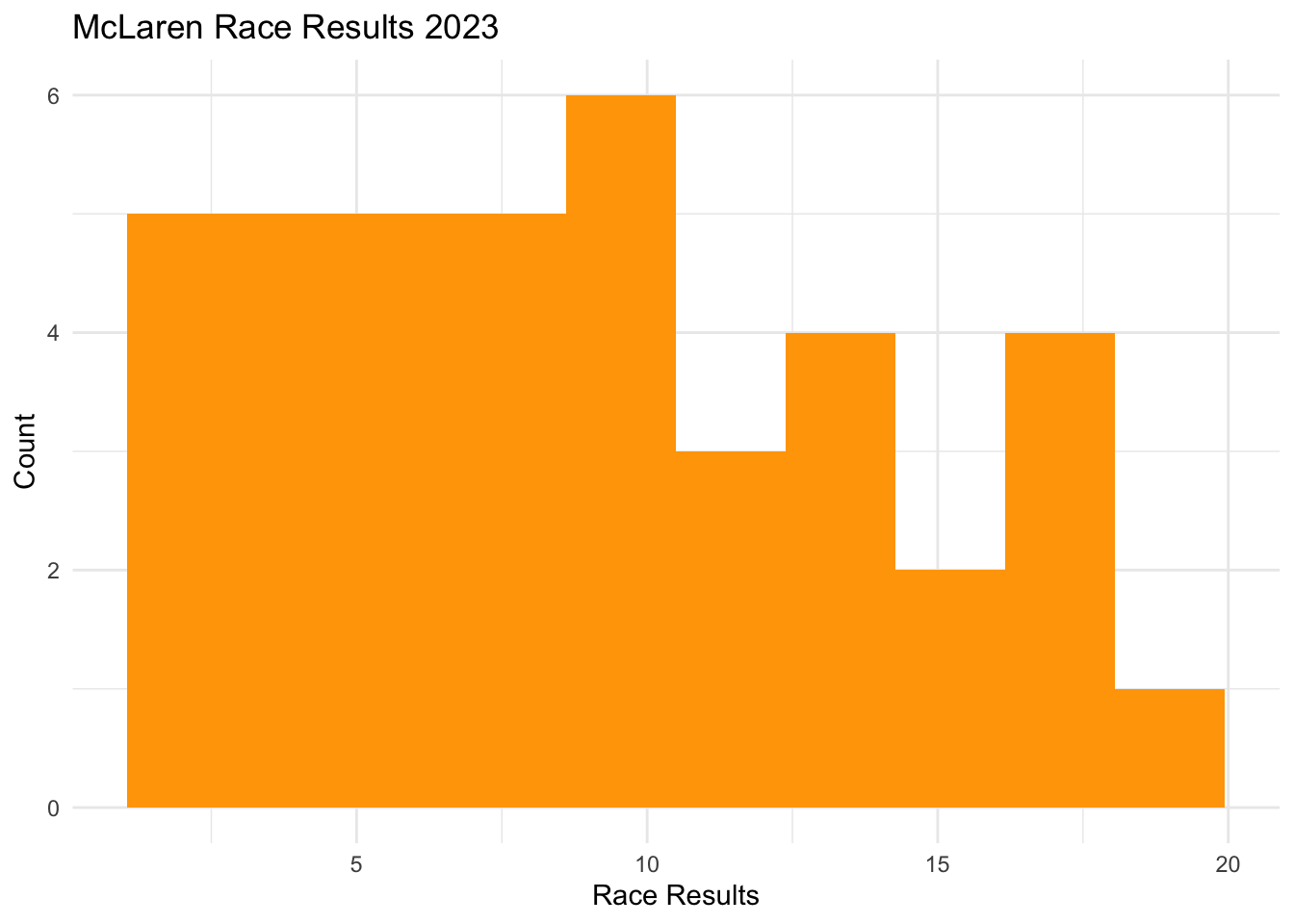
In ggplot2, to build a histogram we use geom_histogram(), and only one numeric variable is needed as input. In the following example, we will look at the distribution of the final positions of the McLaren 2023 season for both of their drivers. To set up this histogram, I construct a new variable called, final_position, and save it as a new object called McLarenStandings_2023.
McLarenStandings_2023 <- McLarenStandings_2023 |>mutate(final_position_numeric =ifelse(final_position =="DNF", 0, as.numeric(final_position)))ggplot(McLarenStandings_2023, aes(x = final_position_numeric)) +## we use fill for bars not color and we can adjust bins heregeom_histogram(fill ="orange", bins =10) +labs(title ="McLaren Race Results 2023", x ="Race Results", y ="Count") +theme_minimal()
aes(x = final_position_numeric): Defines the variable for the histogram.
geom_histogram(): Creates the histogram.
fill = "orange": Fills the bars with orange.
bins = 10: Adjust the number of bins (change as needed).
labs(): Adds title and axis labels.
theme_minimal(): Uses a cleaner theme.
In a histogram, bins represent the intervals (or ranges) into which data points are grouped. Each bin covers a specific range of values, and the height of the bar represents the number of observations (or frequency) that fall within that range.
Bar Plot
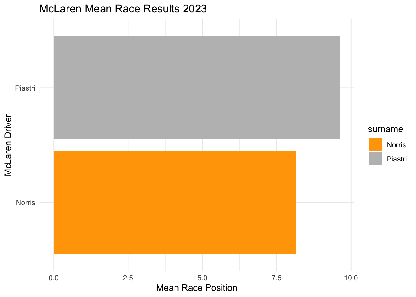
Now, let’s say we wanted to compare this across different categories, therefore instead we can use bar plots instead of histograms. In the following example, we will look at the distribution of the final positions of the McLaren 2023 season for both of their drivers. To set up this histogram, I construct a new variable called, final_position, and save it as a new object called McLarenStandings_2023.
# Summarize mean race positions by driverbarplot <- McLarenStandings_2023 |>group_by(surname) |>summarize(mean_position =mean(final_position_numeric))# Create a bar plot of mean race positionsggplot(barplot, aes(x = mean_position, y = surname, fill = surname)) +geom_col() +labs(title ="McLaren Mean Race Results 2023", x ="Mean Race Position", y ="McLaren Driver") +scale_fill_manual(values =c("orange", "grey")) +theme_minimal()
aes(x = mean_position, y = surname, fill = surname):
x = mean_position: The x-axis represents the mean race position of each driver.
y = surname: The y-axis represents the driver’s name.
fill = surname: Each driver gets a unique color for their bar.
geom_col():
Creates a bar chart where the bar length represents the mean race position
scale_fill_manual(values = c("orange", "grey")):
Manually assigns colors to the bars.
"orange" for one driver and "grey" for the other (representing McLaren’s team colors).
Box Plots
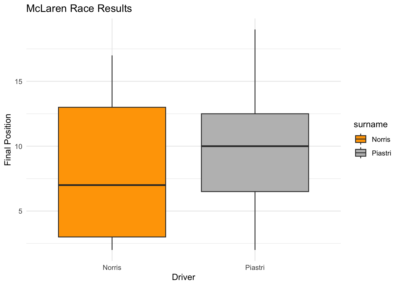
To make a box plot we use the geom_boxplot() function! In the following example, we will look at the distribution of the final positions of the McLaren 2023 season for both of their drivers. To set up this histogram, I construct a new variable called, final_position, and save it as a new object called McLarenStandings_2023.
ggplot(McLarenStandings_2023, aes(x = surname, y = final_position_numeric, fill = surname)) +geom_boxplot() +scale_fill_manual(values =c("orange", "grey")) +# Assign McLaren colorslabs(title ="McLaren Race Results", x ="Driver", y ="Final Position") +theme_minimal()
aes(x = surname, y = final_position_numeric, fill = surname):
x = surname: Drivers on the x-axis.
y = final_position_numeric: Final race position on the y-axis.
fill = surname: Colors the boxes based on the driver.
geom_boxplot(): Creates a boxplot to show the distribution of race positions.
The box and whisker plot represents the middle 50% of race finishes for each driver, while the horizontal line inside the box is the median race position, the whiskers show the range of most race finishes (excluding outliers), and any dots outside the whiskers indicate outliers.
Class Examples
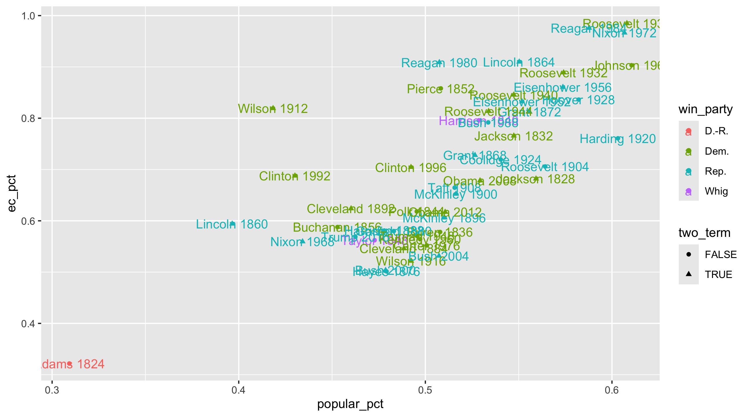
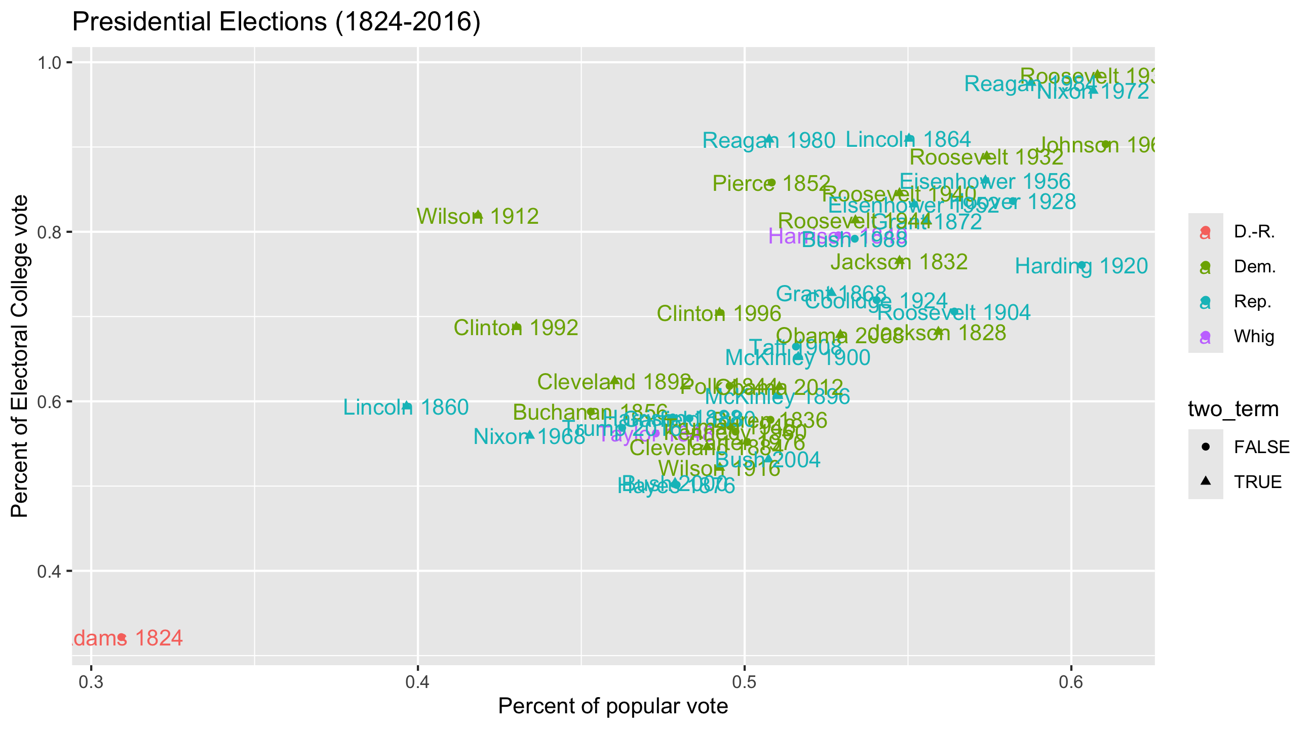
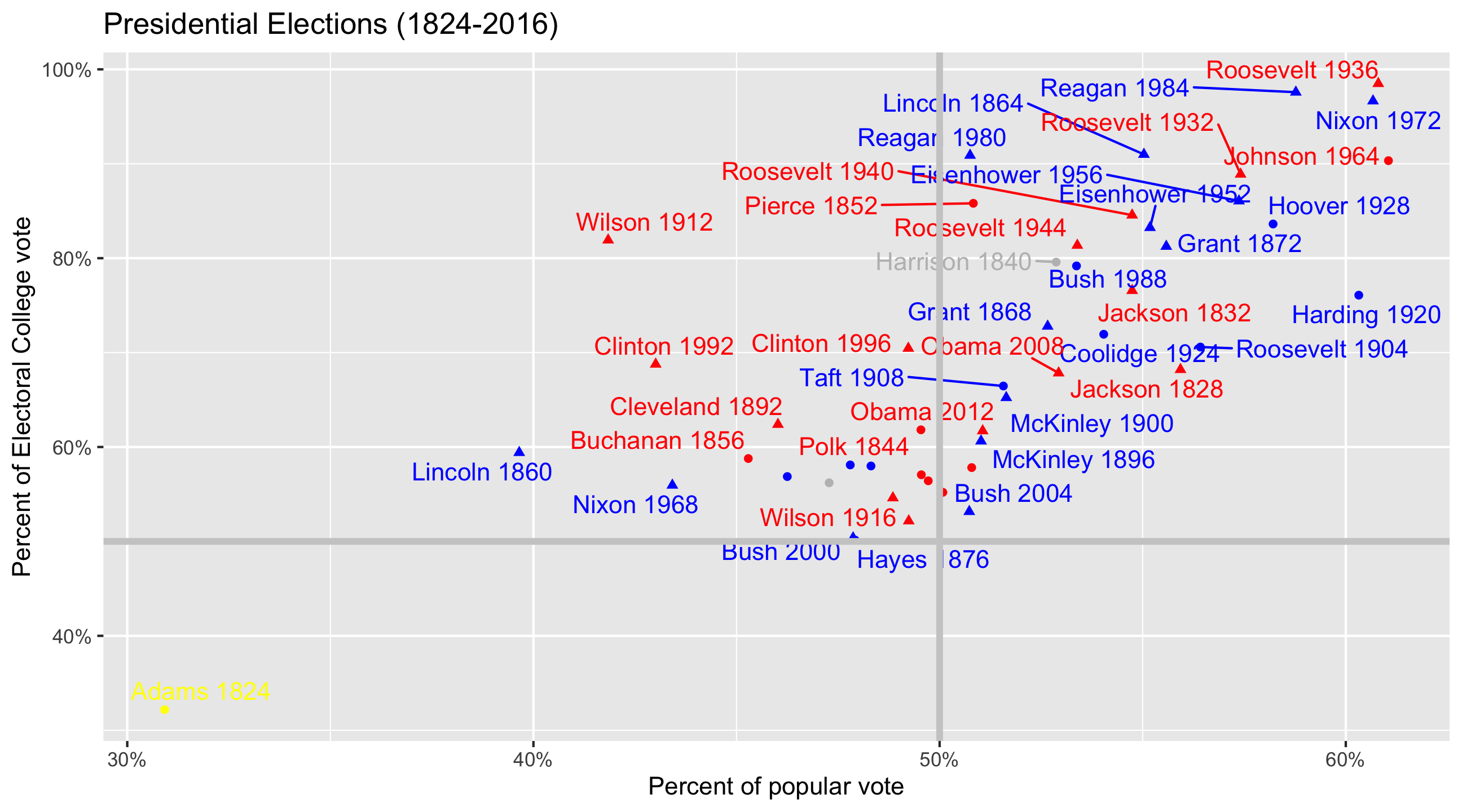
Presidential elections code-through
We’re working with elections_historic from the {socviz} package. This code loads {socviz}, {tidyverse} (where ggplot() lives) and the dataset: