Now that you know the basics, we can add more details and change things.
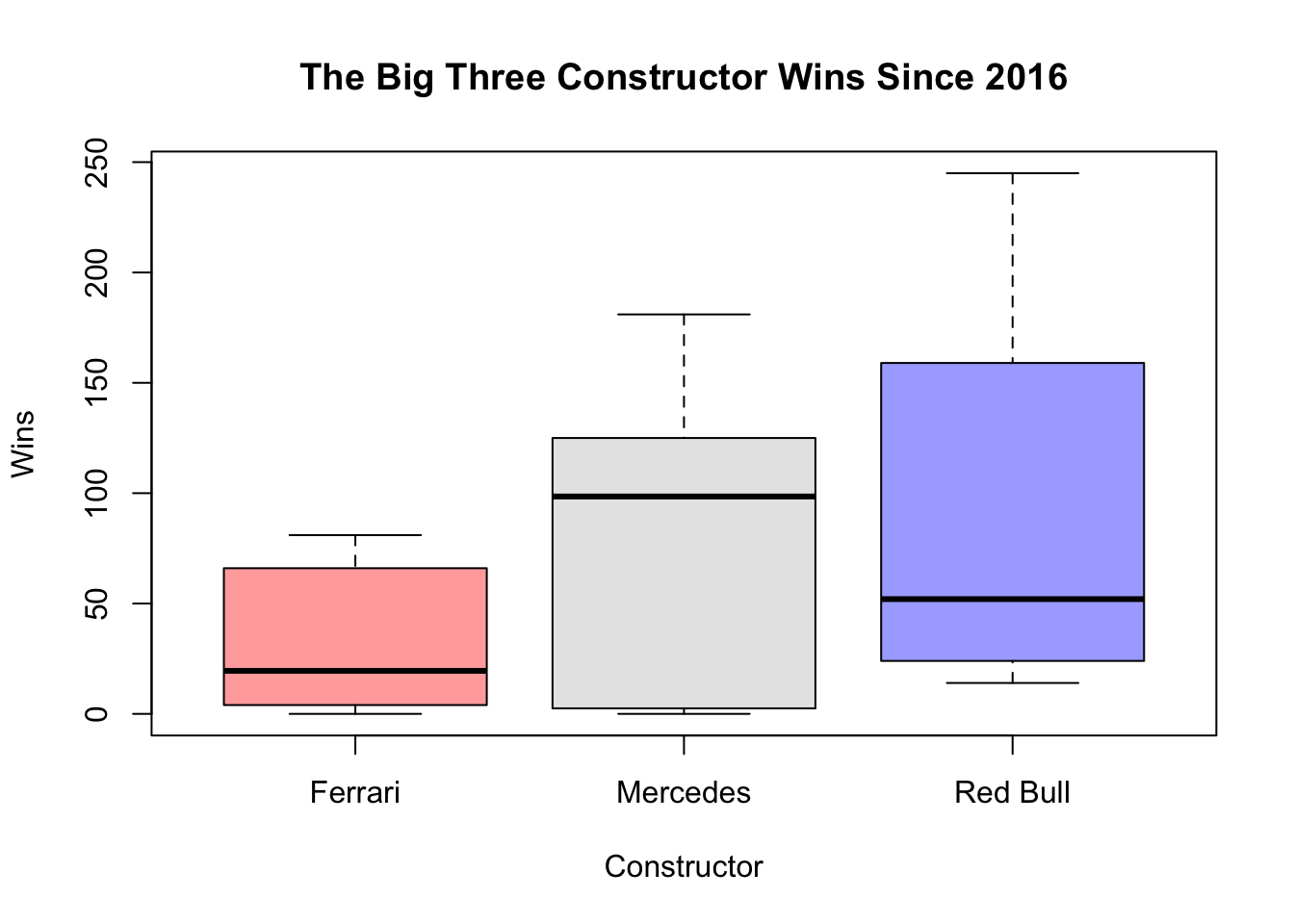
I have provided some examples. In the first example, I add three different box plots with different colors and I adjust opacity of the colors.
library(tidyverse)
── Attaching core tidyverse packages ──────────────────────── tidyverse 2.0.0 ──
✔ dplyr     1.1.4     ✔ readr     2.1.5
✔ forcats   1.0.0     ✔ stringr   1.5.1
✔ ggplot2   3.5.2     ✔ tibble    3.3.0
✔ lubridate 1.9.4     ✔ tidyr     1.3.1
✔ purrr     1.1.0
── Conflicts ────────────────────────────────────────── tidyverse_conflicts() ──
✖ dplyr::filter() masks stats::filter()
✖ dplyr::lag()    masks stats::lag()
ℹ Use the conflicted package (<http://conflicted.r-lib.org/>) to force all conflicts to become errors
library(RandomData)## BOX PLOT ### Wrangle the Datathebigthree <- constructors_stats |># Filter for the top 3 constructors since 2016 filter((constructor =="Mercedes"| constructor =="Red Bull"| constructor =="Ferrari") & year >2016) |># calculate total wins per year per constructorgroup_by(constructor, year) |>summarize(total_wins =sum(constructor_wins))
`summarise()` has grouped output by 'constructor'. You can override using the
`.groups` argument.
# Create boxplotboxplot(total_wins ~ constructor, data = thebigthree,main ="The Big Three Constructor Wins Since 2016",xlab ="Constructor",ylab ="Wins",col =c(adjustcolor("red", alpha.f =0.4), # alpha.f adjusts the opacityadjustcolor("grey", alpha.f =0.4),adjustcolor("blue", alpha.f =0.4)))
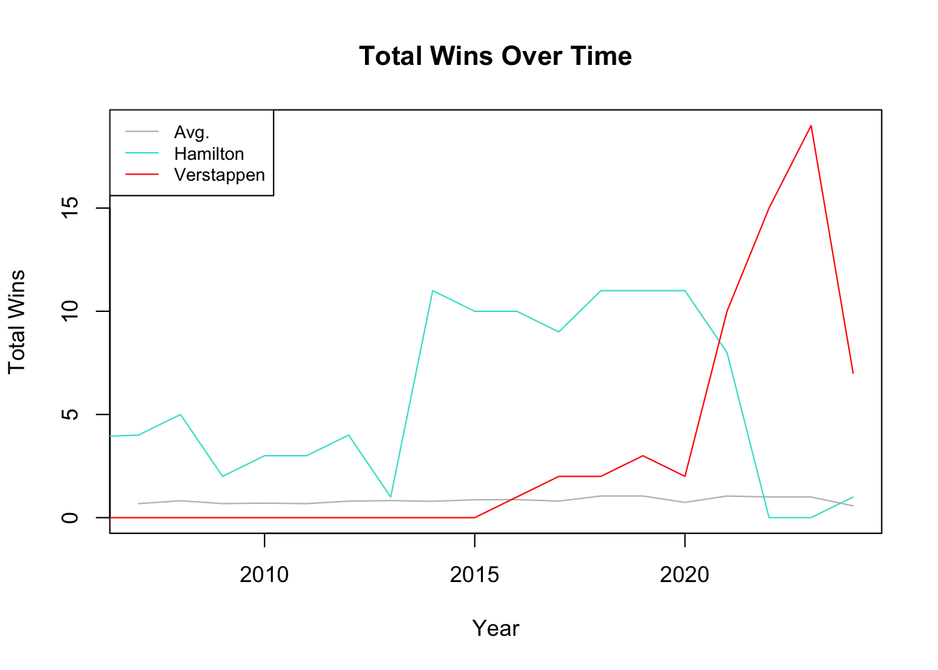
In my second example, I add two more lines to my time series graph, change their colors, and also add a legend.
## TIME SERIES ### Wrangle the Data# Avg wins for all drivers since 2006avg_wins <- driver_stats |>filter(year >2006) |>group_by(surname, year) |>summarize(max_wins =max(driver_wins)) |>ungroup() |>group_by(year) |>summarize(total_wins =mean(max_wins))
`summarise()` has grouped output by 'surname'. You can override using the
`.groups` argument.
# Avg wins for Lewis Hamilton since joining the grid in 2007hamilton <- driver_stats |># Filter for the Lewis Hamiltonfilter(surname =="Hamilton") |># calculate total wins per year for Hamiltongroup_by(year) |>summarize(total_wins =sum(max(driver_wins)))# Avg wins for Max Verstappen since joining the grid in 2015verstappen <- driver_stats |># Filter for Max Verstappenfilter(surname=="Verstappen") |># calculate total wins per year for Verstappengroup_by(year) |>summarize(total_wins =sum(max(driver_wins)))# Create Time Series Plotplot(avg_wins$year, avg_wins$total_wins, type ="l",col ="grey",main ="Total Wins Over Time",xlab ="Year",ylab ="Total Wins",ylim =range(c(avg_wins$total_wins, hamilton$total_wins, verstappen$total_wins )))# Add lines for Hamilton and Verstappenlines(hamilton$year, hamilton$total_wins, col ="turquoise", type ="l")lines(verstappen$year, verstappen$total_wins, col ="red", type ="l")# Add a legend to the plotlegend("topleft", legend =c("Avg.", "Hamilton", "Verstappen"),col =c("grey", "turquoise", "red"), lty =1, cex =0.8)