scatterplot <- race_stats |>
  filter(circuit == "Las Vegas Strip Street Circuit" & year == "2023")

ggplot(scatterplot, aes(quali_position, points)) +
        geom_point()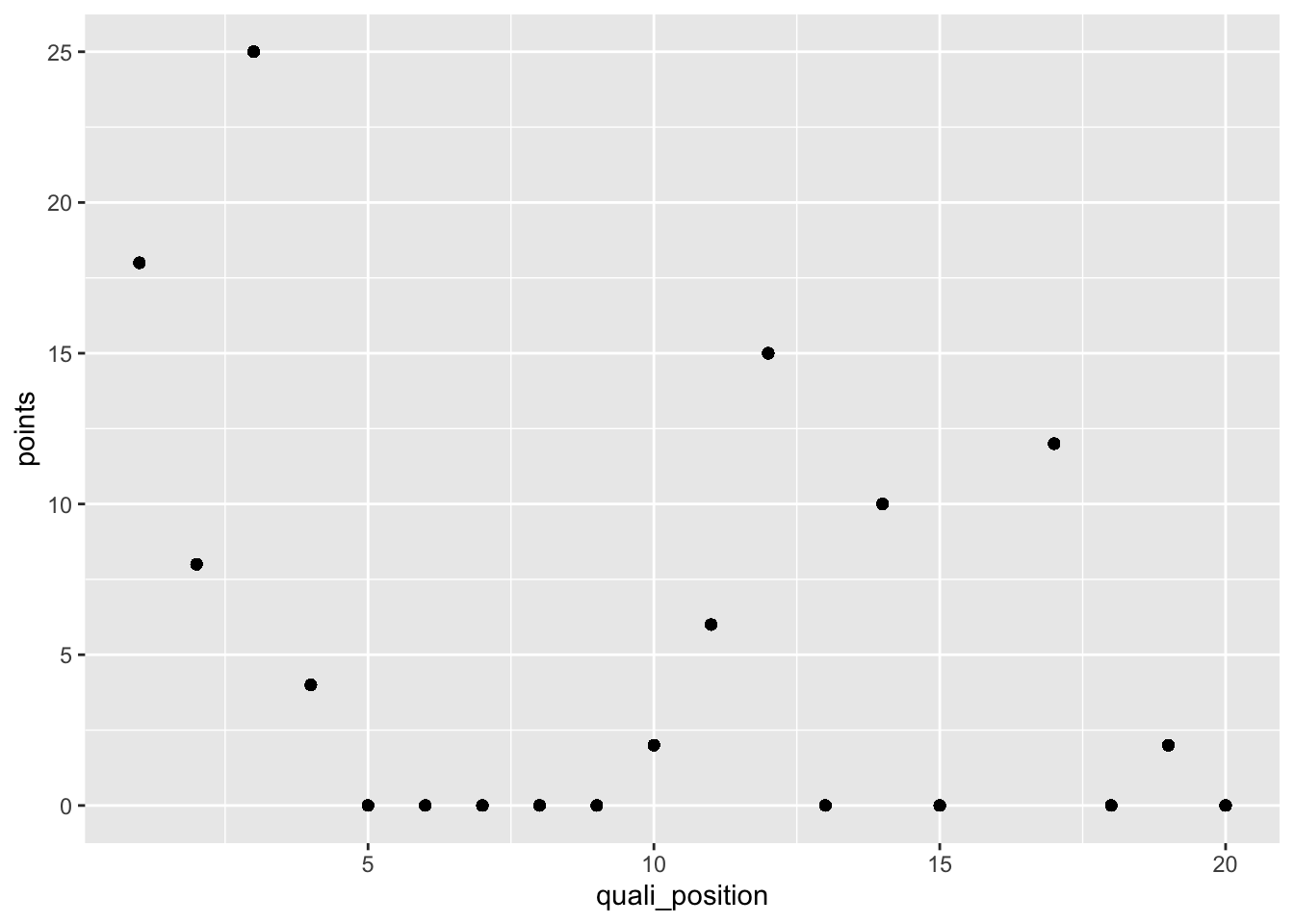
The first plot style we will be looking at is a scatter plot. To plot a scatter plot in ggplot you will use the format discussed above and to tell r you want it to graph a scatter plot you will use the geom function; geom_point().
In the following example, we will plot the qualifying position for the 20 drivers and the final points they were awarded for the Las Vegas Grand Prix in 2023.
scatterplot <- race_stats |>
filter(circuit == "Las Vegas Strip Street Circuit" & year == "2023")
ggplot(scatterplot, aes(quali_position, points)) +
geom_point()
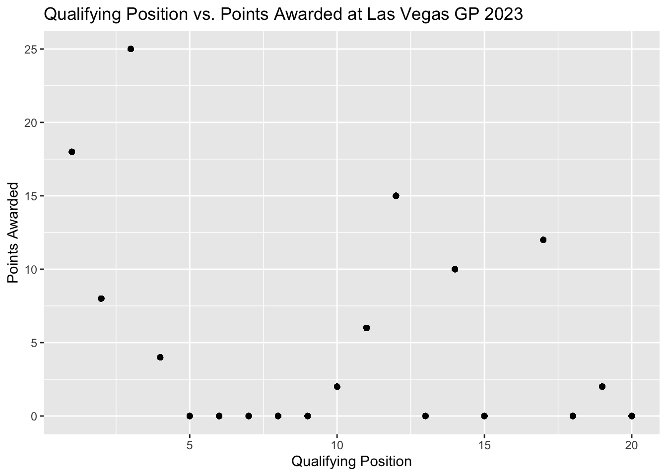
Let’s add a main title and adjust the x and y labels.
ggplot(scatterplot, aes(quali_position, points)) +
        geom_point() +
        labs(
          x = "Qualifying Position",
          y = "Points Awarded",
          title = "Qualifying Position vs. Points Awarded at Las Vegas GP 2023"
        )
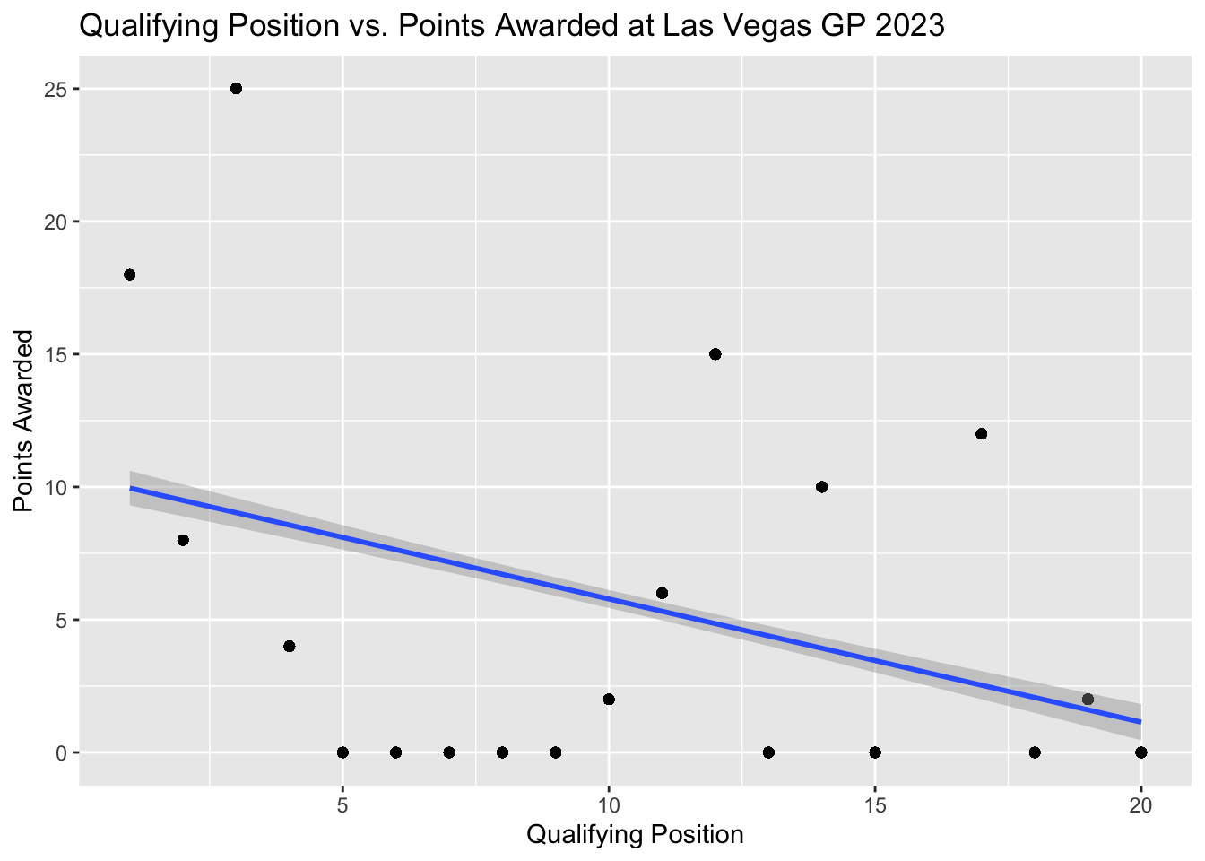
If we wanted to add a smoother line we would use the geom_smooth() and we will be fitting a linear regression line, thus inside geom_smooth() we method = "lm".
ggplot(scatterplot, aes(quali_position, points)) +
        geom_point() +
        labs(
          x = "Qualifying Position",
          y = "Points Awarded",
          title = "Qualifying Position vs. Points Awarded at Las Vegas GP 2023"
        ) +
        geom_smooth(method = "lm")
`geom_smooth()` using formula = 'y ~ x'