# plot(x, y,
#       xlab = "Independent Variable (x)", # Label for the x-axis
#       ylab = "Dependent Variable (y)", # Label for the y-axis
#       xlim = c(0, 12), # Limits for the x-axis
#       ylim = c(0, 120), # Limits for the y-axis
#       main = "Scatterplot of the Relationship between X and Y",
#               Main title of the plot
#       col = "black", # Color of the points
# pch = 19) # Shape of pointsScatter Plots
The first plot style we will be looking at is a scatter plot. To plot a scatter plot you will use the most common function in base r to plot it, plot() .
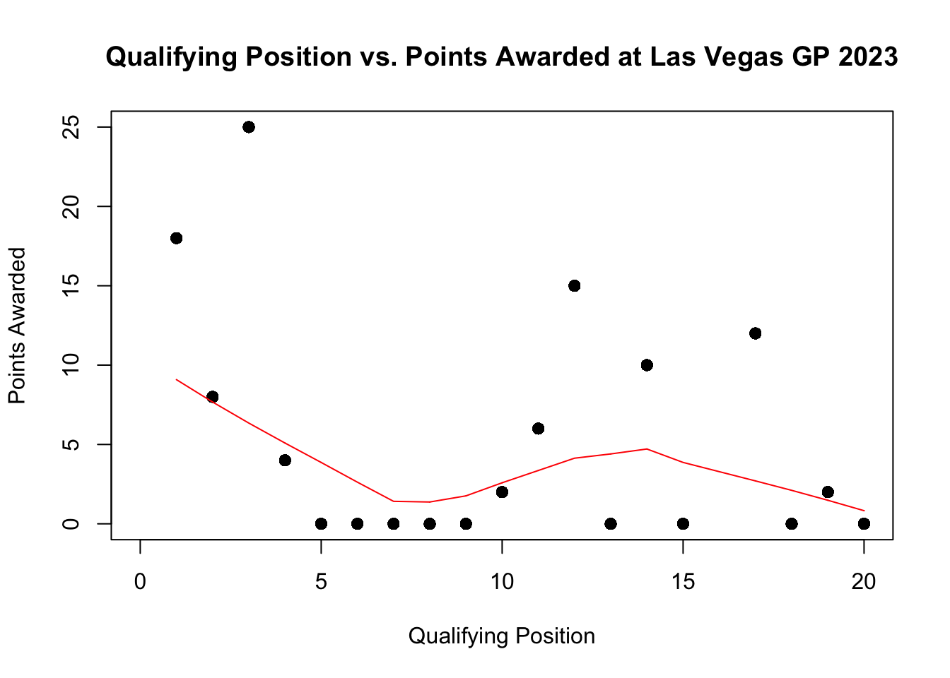
In the following example, we will plot the qualifying position for the 20 drivers and the final points they were awarded for the Las Vegas Grand Prix in 2023.
library(tidyverse)── Attaching core tidyverse packages ──────────────────────── tidyverse 2.0.0 ──
✔ dplyr 1.1.4 ✔ readr 2.1.5
✔ forcats 1.0.0 ✔ stringr 1.5.1
✔ ggplot2 3.5.2 ✔ tibble 3.3.0
✔ lubridate 1.9.4 ✔ tidyr 1.3.1
✔ purrr 1.1.0
── Conflicts ────────────────────────────────────────── tidyverse_conflicts() ──
✖ dplyr::filter() masks stats::filter()
✖ dplyr::lag() masks stats::lag()
ℹ Use the conflicted package (<http://conflicted.r-lib.org/>) to force all conflicts to become errorslibrary(RandomData)
scatterplot <- race_stats |>
filter(circuit == "Las Vegas Strip Street Circuit" & year == "2023")
plot(scatterplot$quali_position, scatterplot$points,
xlab= "Qualifying Position",
ylab= "Points Awarded",
xlim = c(0, 20),
ylim = c(0, 25),
main = "Qualifying Position vs. Points Awarded at Las Vegas GP 2023",
col = "black",
pch = 19)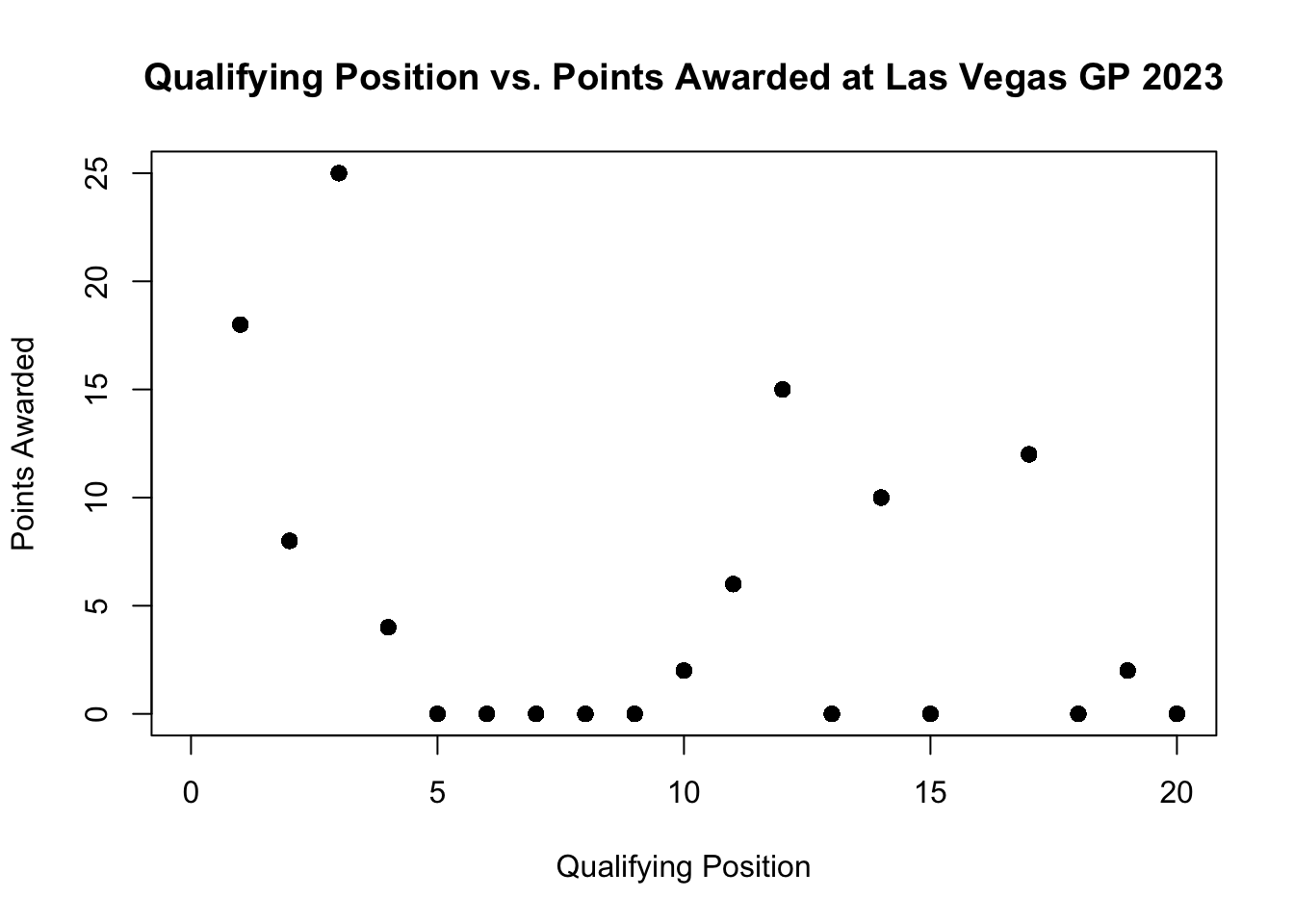
If you wanted to add a line that shows the correlation we can do this by adding the lines() after the plot.
plot(scatterplot$quali_position, scatterplot$points,
     xlab= "Qualifying Position",
     ylab= "Points Awarded",
     xlim = c(0, 20),
     ylim = c(0, 25),
     main = "Qualifying Position vs. Points Awarded at Las Vegas GP 2023",
     col = "black",
     pch = 19)
lines(lowess(scatterplot$quali_position, scatterplot$points), col = "red")