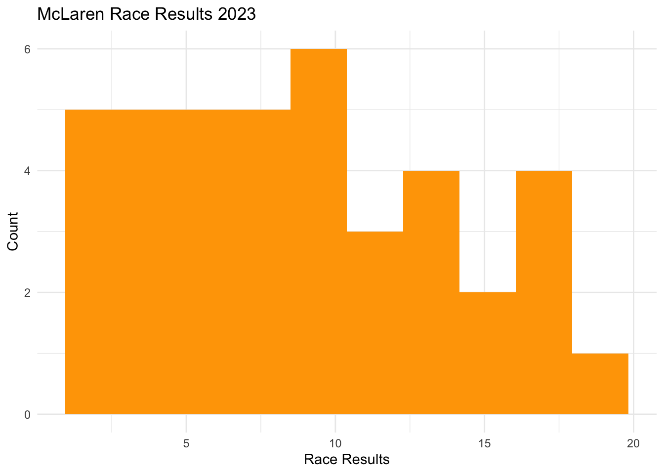
In ggplot2 to build a histogram we put geom_histogram() and we only one numeric variable is needed in the input. In the following example, we will look at the distribution of the final positions of the McLaren 2023 season for both of their drivers. To set up this histogram, I construct a new variable called, final_position, and save it as a new object called McLarenStandings_2023.
McLarenStandings_2023 <- McLarenStandings_2023 |>mutate(final_position_numeric =ifelse(final_position =="DNF", 0, as.numeric(final_position)))ggplot(McLarenStandings_2023, aes(x = final_position_numeric)) +## we use fill for bars not color and we can adjust bins heregeom_histogram(fill ="orange", bins =10) +labs(title ="McLaren Race Results 2023", x ="Race Results", y ="Count") +theme_minimal()
aes(x = final_position_numeric): Defines the variable for the histogram.
geom_histogram(): Creates the histogram.
fill = "orange": Fills the bars with orange.
bins = 10: Adjust the number of bins (change as needed).
labs(): Adds title and axis labels.
theme_minimal(): Uses a cleaner theme.
In a histogram, bins represent the intervals (or ranges) into which data points are grouped. Each bin covers a specific range of values, and the height of the bar represents the number of observations (or frequency) that fall within that range.