A time series plot looks at a variable over time to see trends. To make a time series graph, we use the same function as scatter plots, plot(), however, we change the type of graph from a point to a line graph. We can do this by changing the type = in the function from a type = "p" to a type = "l". In addition, the variable on the x-axis should always be a variable that measures time.
library(tidyverse)
── Attaching core tidyverse packages ──────────────────────── tidyverse 2.0.0 ──
✔ dplyr     1.1.4     ✔ readr     2.1.5
✔ forcats   1.0.0     ✔ stringr   1.5.1
✔ ggplot2   3.5.2     ✔ tibble    3.3.0
✔ lubridate 1.9.4     ✔ tidyr     1.3.1
✔ purrr     1.1.0
── Conflicts ────────────────────────────────────────── tidyverse_conflicts() ──
✖ dplyr::filter() masks stats::filter()
✖ dplyr::lag()    masks stats::lag()
ℹ Use the conflicted package (<http://conflicted.r-lib.org/>) to force all conflicts to become errors
library(RandomData)# Time Series Plot# plot(data$y ~ data$timevariable,# type ="l",# col = "color", # main = "Main Title",# ylab = "Label Y-axsis",# xlab = "Label X-axsis")
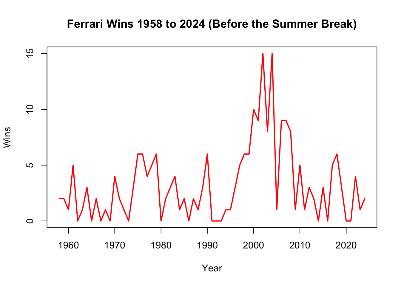
In the following example, we look at the total wins for Ferrari drivers over time.
# Calculate total wins per year for Ferrariferrari_wins <- constructors_stats |>filter(constructor =="Ferrari") |>group_by(year) |>summarize(total_wins =sum(max(constructor_wins)))## Make Time Series plotplot(ferrari_wins$total_wins ~ ferrari_wins$year,# make it a line not pointstype ="l", # add colorcol =c("red"), # change width of the linelwd =2, # add main titlemain ="Ferrari Wins 1958 to 2024 (Before the Summer Break)",# add title on x-axsisxlab ="Year", # add title on y-axsisylab ="Wins")