Boxplots (or box-and-whisker plots) are useful to graphically summarise the distribution of a variable, identify potential unusual values and compare distributions between different groups. We use the function boxplot() .
To set up this boxplot, I construct a new variable called, final_position, and save it as a new object called McLarenStandings_2023. I will use this new variable and make it numeric, calling it final_position_numeric.
library(tidyverse)
── Attaching core tidyverse packages ──────────────────────── tidyverse 2.0.0 ──
✔ dplyr     1.1.4     ✔ readr     2.1.5
✔ forcats   1.0.0     ✔ stringr   1.5.1
✔ ggplot2   3.5.2     ✔ tibble    3.3.0
✔ lubridate 1.9.4     ✔ tidyr     1.3.1
✔ purrr     1.1.0
── Conflicts ────────────────────────────────────────── tidyverse_conflicts() ──
✖ dplyr::filter() masks stats::filter()
✖ dplyr::lag()    masks stats::lag()
ℹ Use the conflicted package (<http://conflicted.r-lib.org/>) to force all conflicts to become errors
library(RandomData)McLarenStandings_2023 <- race_stats |>select(circuit, year, constructor, surname) |># remove duplicatesunique() |>filter(constructor =="McLaren"& year ==2023) |>mutate(final_position =case_when(#PIASTRI circuit =="Bahrain International Circuit"& surname =="Piastri"~"DNF", circuit =="Jeddah Corniche Circuit"& surname =="Piastri"~"15", circuit =="Albert Park Grand Prix Circuit"& surname =="Piastri"~"8", circuit =="Baku City Circuit"& surname =="Piastri"~"11", circuit =="Miami International Autodrome"& surname =="Piastri"~"19", circuit =="Circuit de Monaco"& surname =="Piastri"~"10", circuit =="Circuit de Barcelona-Catalunya"& surname =="Piastri"~"13", circuit =="Circuit Gilles Villeneuve"& surname =="Piastri"~"11", circuit =="Red Bull Ring"& surname =="Piastri"~"16", circuit =="Silverstone Circuit"& surname =="Piastri"~"4", circuit =="Hungaroring"& surname =="Piastri"~"5", circuit =="Circuit de Spa-Francorchamps"& surname =="Piastri"~"DNF", circuit =="Circuit Park Zandvoort"& surname =="Piastri"~"9", circuit =="Autodromo Nazionale di Monza"& surname =="Piastri"~"12", circuit =="Marina Bay Street Circuit"& surname =="Piastri"~"7", circuit =="Suzuka Circuit"& surname =="Piastri"~"3", circuit =="Losail International Circuit"& surname =="Piastri"~"2", circuit =="Circuit of the Americas"& surname =="Piastri"~"DNF", circuit =="Autódromo Hermanos Rodríguez"& surname =="Piastri"~"8", circuit =="Autódromo José Carlos Pace"~"14", circuit =="Las Vegas Strip Street Circuit"& surname =="Piastri"~"10", circuit =="Yas Marina Circuit"& surname =="Piastri"~"6",# NORRIS circuit =="Bahrain International Circuit"& surname =="Norris"~"17", circuit =="Jeddah Corniche Circuit"& surname =="Norris"~"17", circuit =="Albert Park Grand Prix Circuit"& surname =="Norris"~"6", circuit =="Baku City Circuit"& surname =="Norris"~"9", circuit =="Miami International Autodrome"& surname =="Norris"~"17", circuit =="Circuit de Monaco"& surname =="Norris"~"9", circuit =="Circuit de Barcelona-Catalunya"& surname =="Norris"~"17", circuit =="Circuit Gilles Villeneuve"& surname =="Norris"~"13", circuit =="Red Bull Ring"& surname =="Norris"~"4", circuit =="Silverstone Circuit"& surname =="Norris"~"2", circuit =="Hungaroring"& surname =="Norris"~"2", circuit =="Circuit de Spa-Francorchamps"& surname =="Norris"~"7", circuit =="Circuit Park Zandvoort"& surname =="Norris"~"9", circuit =="Autodromo Nazionale di Monza"& surname =="Norris"~"8", circuit =="Marina Bay Street Circuit"& surname =="Norris"~"2", circuit =="Suzuka Circuit"& surname =="Norris"~"2", circuit =="Losail International Circuit"& surname =="Norris"~"3", circuit =="Circuit of the Americas"& surname =="Norris"~"3", circuit =="Autódromo Hermanos Rodríguez"& surname =="Norris"~"5", circuit =="Autódromo José Carlos Pace"~"2", circuit =="Las Vegas Strip Street Circuit"& surname =="Norris"~"DNF", circuit =="Yas Marina Circuit"& surname =="Norris"~"5" ) ) |>mutate(final_position_numeric =as.numeric(final_position))# boxplot(data$y ~ data$x, # col = "color", # main = "Main Title",# ylab = "Label Y-axsis",# xlab = "Label X-axsis")
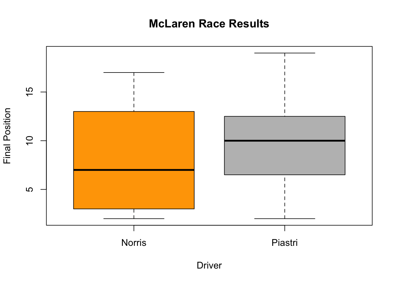
In the example we will be using, plots the final position standings for the two McLaren Drivers during the 2023 season.
# Boxplot for average race result in 2023 for McLaren Driversboxplot(McLarenStandings_2023$final_position_numeric ~ McLarenStandings_2023$surname, # add color for each drivercol =c("orange", "grey"), # add titlemain ="McLaren Race Results", # add title for y-axsisylab ="Final Position", # add title on x-axsisxlab ="Driver")
The thick horizontal line in the middle of the box is the median of the final positions for the two drivers. The upper line of the box is the upper quartile, the 75th percentile, and the lower line is the lower quartile, the 25th percentile. The distance between the upper and lower quartiles is known as the inter quartile range and represents where 50 percent of final position standings on average were for the two drivers. The dotted vertical lines are called the whiskers and their length is determined as 1.5 x the inter quartile range and any points outside the whiskers are potential outliers.